Earth Tone Living Room Ideas: 15 Warm Palettes Designers Are Using in 2026
Searches for earthy living rooms jumped 220% since 2023. Terracotta, sage, rust, and warm neutrals are replacing cool grays everywhere. Here are 15 earth-tone palettes that actually work — with styling rules to keep them warm without heavy.
 Easy Room AI Team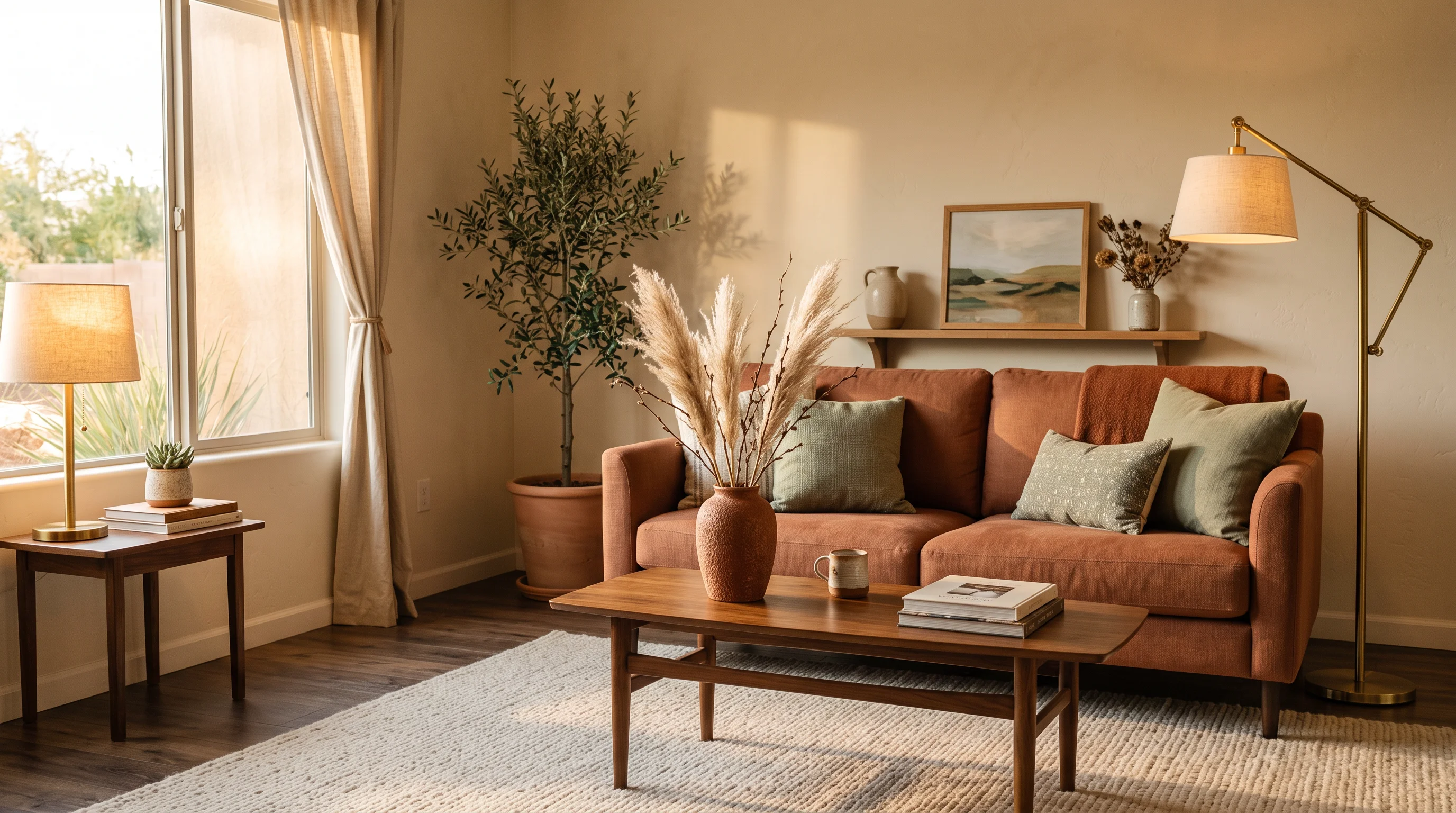
Cool gray is done. After a decade as the default living room neutral, it is being replaced by something warmer, richer, and far more livable — earth tones. Google Trends data shows searches for "earthy living room" jumped over 220 percent between 2023 and early 2026. Pinterest reported that "warm organic interiors" and "terracotta home" topped their 2026 trend boards by February. And the Houzz Summer 2026 Trends Report confirms the palette shift with hard numbers: rust colors up 178 percent, chocolate brown up 153 percent, mushroom up 69 percent, olive green up 57 percent, and sage up 55 percent.
This is not a trend that will date in a season. Earth tones are drawn from the natural world — clay, stone, moss, dried grasses — and that permanence is exactly why designers keep returning to them. Here are 15 earth-tone living room palettes that work, and the styling rules that keep them warm without heavy.
The earth-tone spectrum
Before picking a palette, it helps to understand the range. Earth tones split into two families:
| Warm earth tones | Cool earth tones |
|---|---|
| Terracotta, rust, cognac, ochre, burnt orange, camel, dusty pink | Sage, olive, evergreen, charcoal, dusty blue, taupe, greige |
The most successful earth-tone rooms pick a dominant temperature — warm or cool — and use the other as an accent. A warm-leaning room with one sage green accent reads cohesive. A 50/50 split between warm and cool earth tones can read as unfocused.
The three-color rule
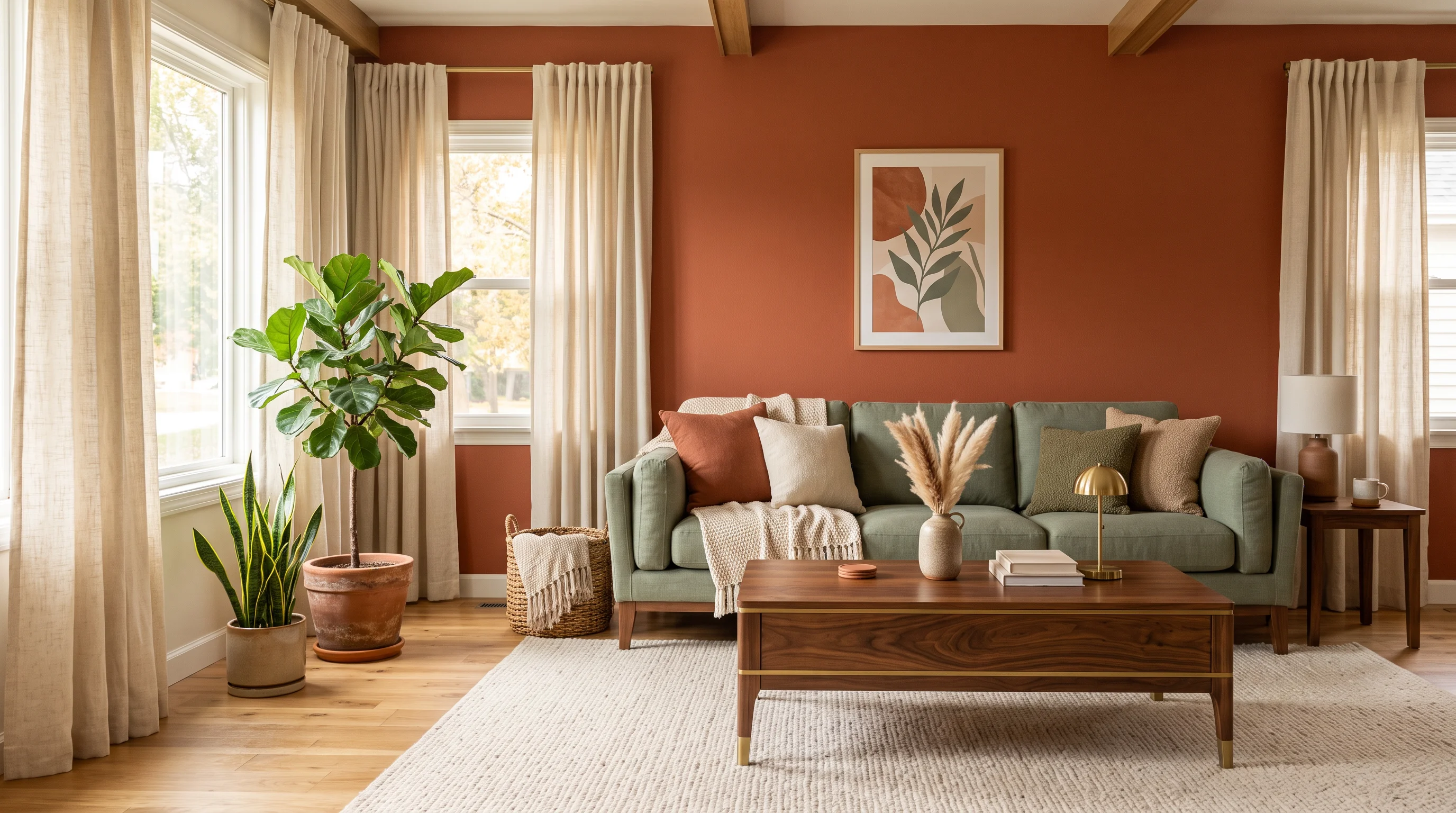
The most common mistake with earth tones is using too many at once. Havenly's design team recommends a simple formula: three primary colors plus a neutral base. More than that and the room gets busy. Fewer and it can feel under-decorated.
How it works in practice:
- Neutral base — warm white or cream walls and a light-toned floor
- Dominant earth tone — the sofa, a feature wall, or a large rug
- Secondary earth tone — accent chairs, throw pillows, or curtains
- Contrast accent — a single grounding element in black, dark wood, or brass
This framework works for every palette below. Pick three colors from the same temperature family, put them on a neutral base, and layer with texture.
Try Earthy Rustic in Your Living Room
Upload a photo of your space to test Earthy Rustic instantly with AI — 100% free.
Supports JPG, PNG, WebP up to 10MB
15 earth-tone palettes for your living room
1. Terracotta + cream + olive
The classic. Terracotta on a feature wall or sofa, cream everywhere else, and olive green through plants, cushions, or a single accent chair. This palette echoes a sun-baked Mediterranean courtyard. It works in rooms with generous natural light.
2. Rust + sage + warm white
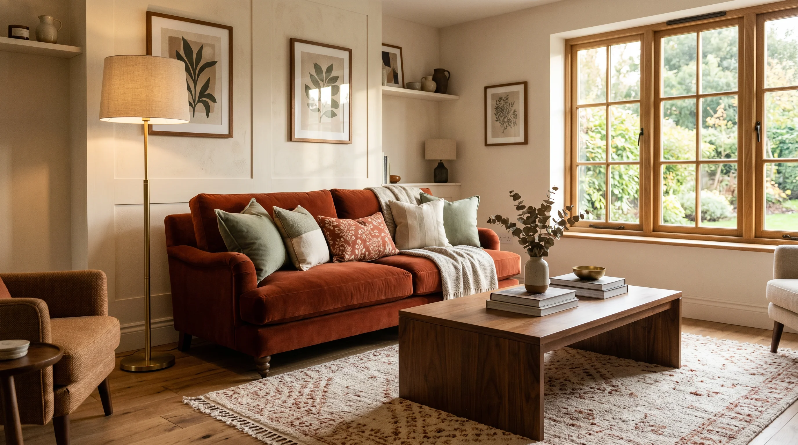
The "it" pairing of 2026. Rust adds richness and depth while sage softens and calms. As Moss & Main puts it, "rust adds richness and unexpected depth, while sage green steps in to soften the vibe and keep things entirely serene." Use cream or warm white as the base to keep the room feeling airy. Pair with dark wood furniture for extra warmth.
3. Mushroom + oatmeal + walnut
The most neutral-forward earth-tone palette. Mushroom — that warm, grey-brown-beige blend — is the 2026 replacement for cool gray. Layered with oatmeal textiles and walnut furniture, it creates a room that feels sophisticated and calming without any bold color at all. Perfect for those who want warmth without drama.
4. Chocolate brown + cream + brass
The luxury earth-tone palette. Chocolate brown on a velvet sofa or painted walls, cream as the counterweight, and brass accents for warmth and polish. This palette leans into the "cocooning" aesthetic that dominates 2026 interiors. The 1stDibs survey found chocolate brown is the top anticipated color at 33 percent.
5. Sage + cream + linen
The gentlest palette on this list. Sage walls or a sage sofa, cream accents, and natural linen curtains and cushions. Nothing competes. This palette works especially well in small living rooms where visual calm is more important than drama. For kitchen applications of this palette, see our sage green kitchen ideas.
6. Rust + charcoal + cream
Earth tones with edge. Rust brings the warmth while charcoal provides grounding contrast that cream alone cannot deliver. This palette works well in modern spaces and pairs naturally with charcoal-toned textiles and black metal accents.
7. Terracotta + dusty blue + sand
An unexpected but balanced combination. The warmth of terracotta meets the coolness of dusty blue, with sand tying them together. This palette is inspired by desert landscapes and works particularly well in rooms with lots of natural light.
8. Olive + cognac + warm gray
Sophisticated and masculine-leaning. Olive green on a feature wall, cognac leather on the sofa or armchair, and warm gray as the neutral base. Add aged brass fixtures and a vintage rug for depth. This is the earth-tone palette that appeals to people who normally avoid color.
9. Ochre + cream + forest green
Bold and warm. Ochre — a golden, spice-like tone — brings energy without the intensity of pure orange. Pair with cream to keep it light and forest green to ground it. This palette works especially well in rooms with dark wood furniture and natural stone accents.
10. Clay + sage + taupe
The softest version of the terracotta family. Clay is pinker, quieter, and easier to live with in large doses than full terracotta. Combined with sage and taupe, it creates a room that feels like a warm breath — present but never demanding.
11. Warm white + walnut + terracotta accents
For those who want 90 percent neutral and 10 percent earth-tone pop. Warm white walls and ceiling, walnut furniture as the primary visual weight, and terracotta only through accessories — a vase, a throw, a piece of pottery. This is the entry point for anyone nervous about committing to a full earth-tone palette.
12. Dusty pink + sage + cream
Soft and romantic. Dusty pink is technically an earth tone — it is the color of dried clay in afternoon light. Paired with sage and cream, it creates a room that feels warm and feminine without tipping into pastels. Ground it with one piece of dark wood to prevent it from floating.
13. Camel + black + warm white
The minimalist earth-tone palette. Camel as the primary color (sofa, rug, or curtains), black for graphic contrast (lamp, frames, hardware), and warm white as the base. This palette aligns with warm minimalism and works in spaces where clutter is kept to a minimum and materials do the talking.
14. Evergreen + cognac + cream
Deep and enveloping. Evergreen walls create a color-drenched effect that makes a room feel like a private retreat. Cognac leather furniture warms the space, and cream textiles keep it from feeling too dark. This palette is particularly powerful in rooms with limited natural light — the dark walls actually make the space feel intentional rather than dim.
15. Full spectrum earth
For confident decorators. Layer multiple earth tones — terracotta cushions, an olive throw, a rust rug, sage curtains — over a cream base. The trick is keeping all the tones at the same saturation level (all muted, or all medium-saturated) so nothing jumps out as mismatched. This is the collected, eclectic approach that feels like a room that evolved over years rather than being decorated in a weekend.
Five styling rules for earth-tone rooms
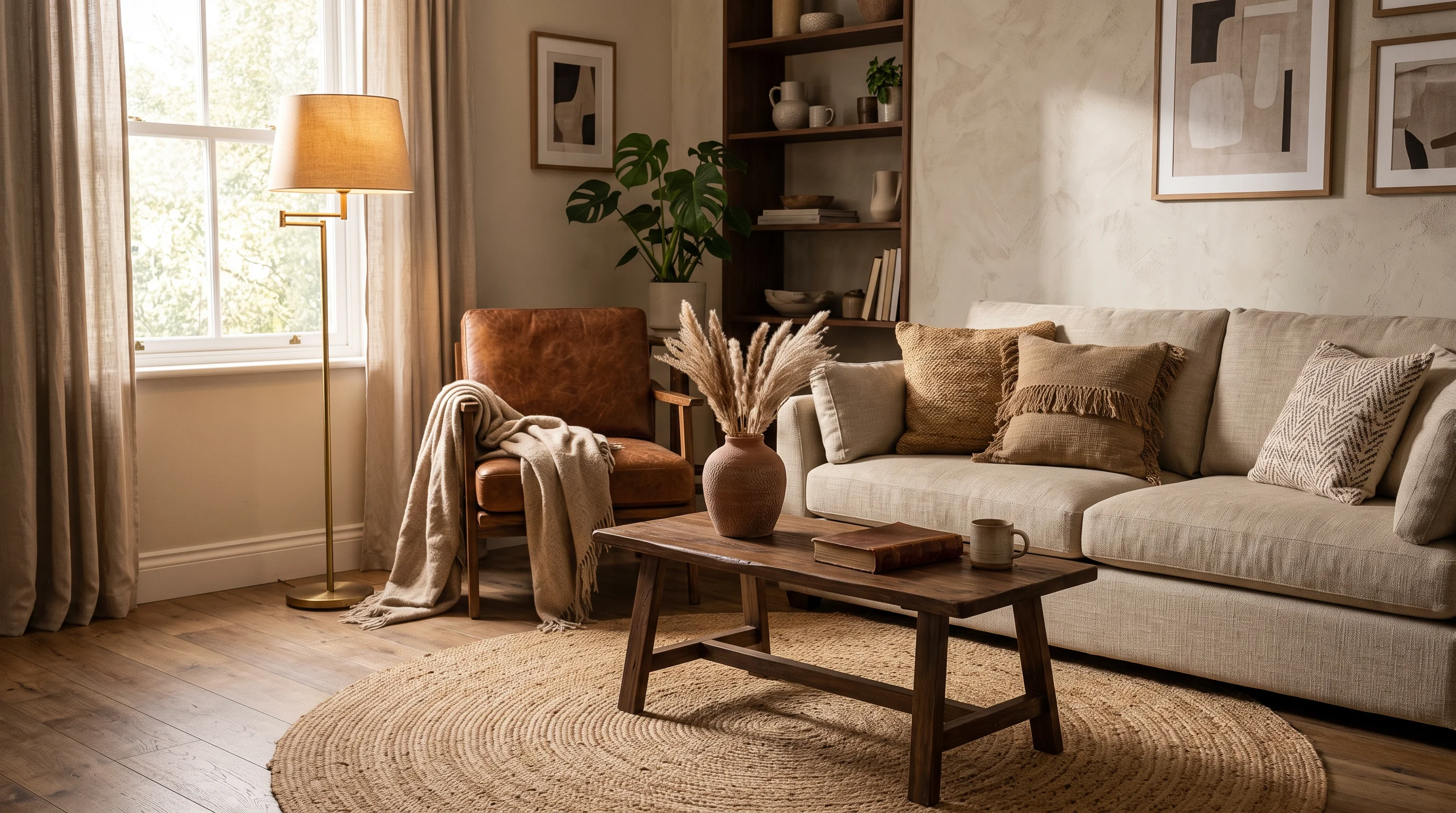
1. Texture prevents flatness. Earth tones can read dull if every surface has the same finish. Mix linen with leather, jute with velvet, rattan with wool. The palette stays muted but the room stays interesting.
2. Warm lighting is non-negotiable. Stick to 2700K bulbs. Cool white light makes terracotta look muddy and sage look grey. Warm light is what makes earth tones glow.
3. One bold, rest quiet. If your sofa is rust, your walls should be cream. If your walls are terracotta, your furniture should be neutral. Let one element lead and everything else support.
4. Ground with dark accents. A black picture frame, a dark wood table, an iron lamp — these anchor an earth-tone room and prevent it from feeling washed out. Without grounding contrast, earth tones can blur together.
5. Let green plants count. Real plants are part of the earth-tone palette. A fiddle-leaf fig, trailing pothos, or collection of succulents adds the natural green that completes the connection to the outdoors.
See earth tones in your own room
Not sure which palette suits your space? Upload a photo of your living room and test different earth-tone palettes with AI — swap wall colors, try a new sofa tone, and see how your room looks in terracotta, sage, or rust before buying a single paint sample.
For more color inspiration, explore our guides to 2026 interior color trends, warm neutral living rooms, and limewash walls.
FAQ
What are earth tone colors for a living room? Earth tones are colors drawn from the natural landscape — terracotta, rust, sage, olive, mushroom, taupe, cream, ochre, charcoal, and dusty blue. They split into warm (terracotta, rust, cognac) and cool (sage, olive, charcoal) families. The most successful earth-tone rooms pick three primary colors from one family plus a neutral base.
Are earth tones trendy or timeless? Both. Earth tones are having a major surge in 2026 — Houzz reports rust up 178 percent and chocolate brown up 153 percent. But because these colors are drawn from nature rather than manufactured trends, they are inherently long-lasting. A well-designed earth-tone room will look current in 2030 the same way it looks current now.
What colors go with terracotta in a living room? Terracotta pairs best with cream or warm white (to balance its warmth), olive or sage green (its natural earthy partner), and warm wood or rattan. Use black or dark wood sparingly for grounding contrast. Avoid cool grays and bright whites, which clash with terracotta's warmth. See our full guide to terracotta living room ideas.
How do I keep earth tones from making a room feel dark? Use lighter earth tones (cream, sand, soft sage) on the largest surfaces — walls and floors — and save deeper tones (rust, chocolate, charcoal) for furniture and accents. Layer your lighting with warm-toned bulbs at multiple heights. And break up earth-tone expanses with texture rather than more color — a jute rug, linen curtains, or a woven basket adds visual interest without adding weight.
Can I mix warm and cool earth tones together? Yes, but pick a dominant temperature. Make 70–80 percent of your palette warm (or cool) and use the opposite as an accent. A warm rust-and-terracotta room with one sage green throw reads intentional. A room that splits 50/50 between warm and cool earth tones often feels undecided.
Ready to Transform Your Space?
Try AI room redesign for free - no credit card required.
Start Designing FreeRelated reading
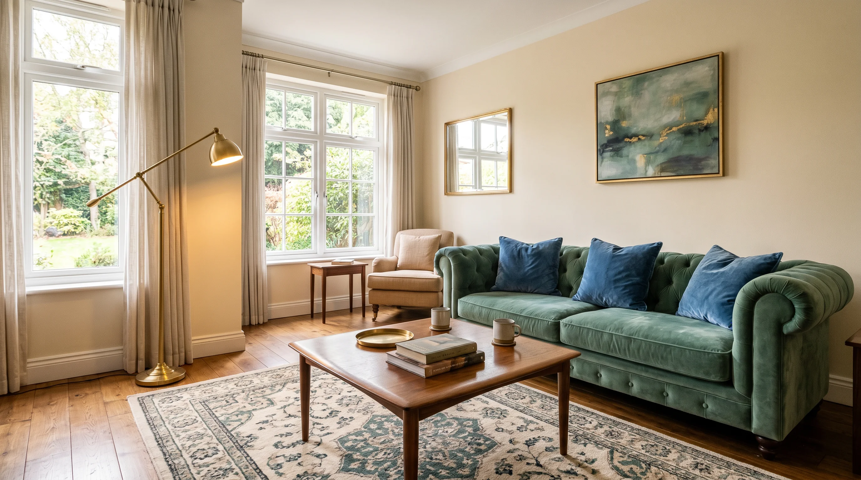
20 Jewel Tone Living Room Ideas — Dusty Emerald, Sapphire, and Ruby Done Right (2026)
Jewel tones are back — but dustier, moodier, and more wearable than the bold versions of a decade ago. Here are 20 jewel tone living room ideas for 2026: emerald sofas, sapphire accent walls, ruby accents, and the warm neutral pairings that keep rich color feeling expensive.
20 Rust Living Room Ideas — 2026's Warmest Color Trend, Styled Right
Rust is the fastest-growing color in home design — Houzz searches jumped 178% this year. Here are 20 rust living room ideas for 2026: sofa, accent wall, and rug ideas, plus the cream-charcoal-sage-navy pairings that keep rust warm without going overwhelming.
Charcoal Living Room: 23 Warm, Dramatic Ideas for 2026
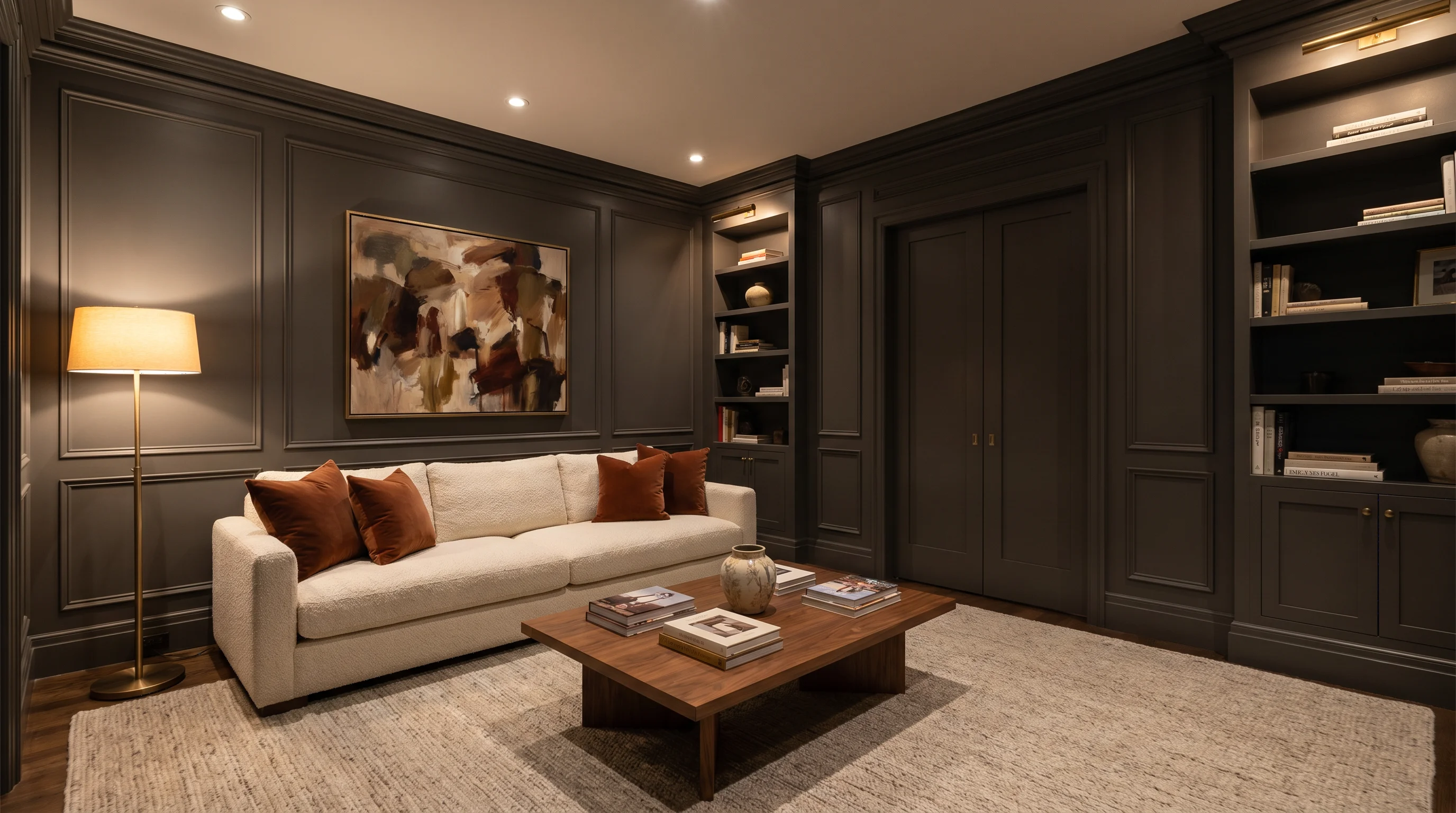
Charcoal is how a living room goes dramatic without going cold — if you get the undertone, lighting, and pairings right. Here are 23 charcoal living room ideas for 2026: charcoal vs black vs slate, keeping it warm, accent wall vs full drench, the best pairings, small-room strategies, and a before-and-after.