Warm Neutral Living Room: 5 Designer Palettes That Replace Cool Gray (2026)
Cool gray is out. Warm neutrals are the new foundation — but 'warm neutral' is not a single color, it's a system. Here are 5 specific designer palettes with exact paint picks, material pairings, and the lighting rules that make them sing.
 Easy Room AI Team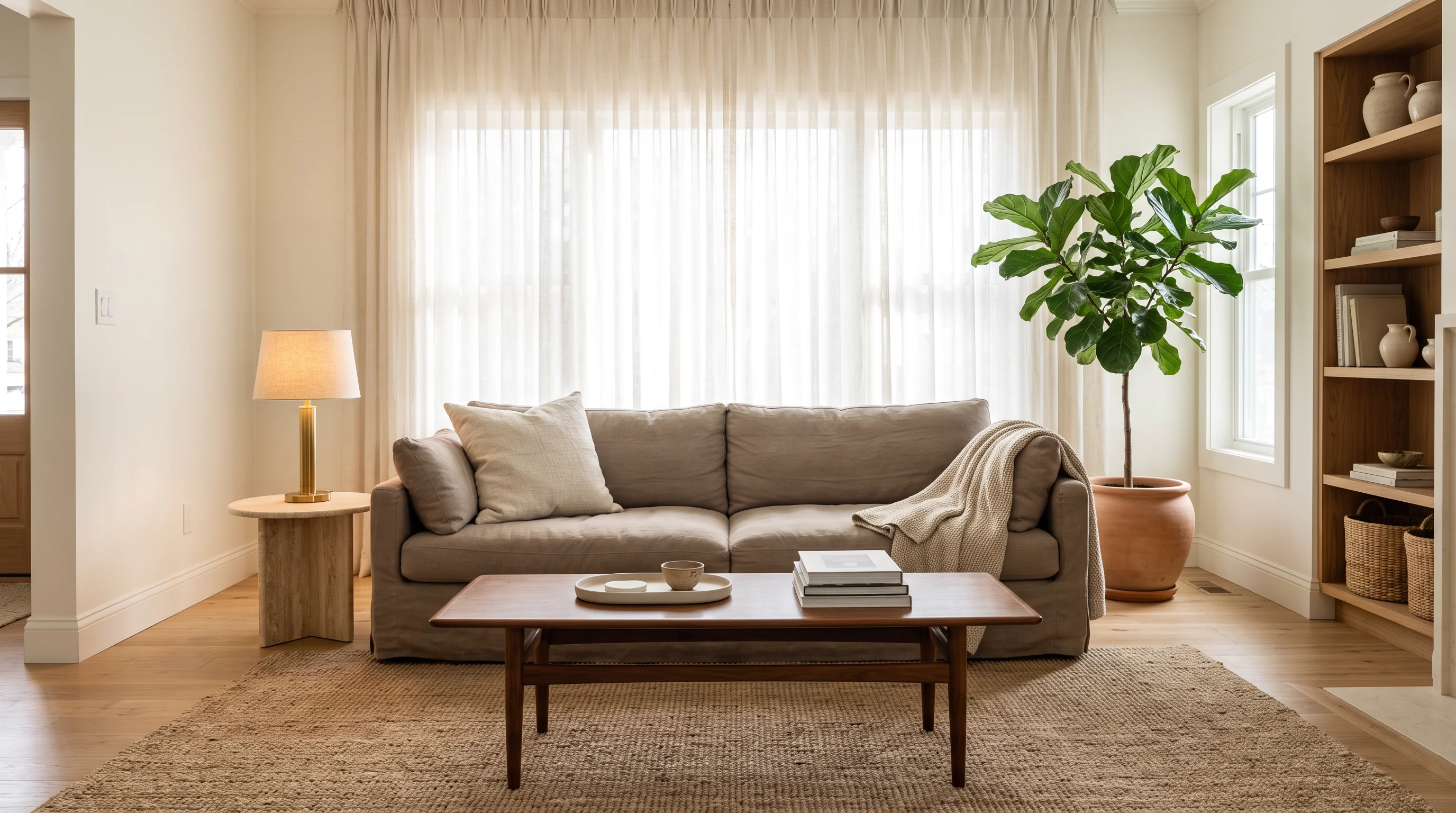
"Warm neutral" sounds simple — until you stand in a paint store staring at 47 shades of beige, none of which look right. The problem is that "warm neutral" is not a color. It is a temperature decision that requires a complete system: a base tone, supporting tones, accent materials, and the right light temperature to hold it all together.
This guide gives you five complete palettes — not just wall colors, but the full material and lighting system that makes each one work. These are the combinations designers are actually specifying in 2026, drawn from trend data (Hackrea, Bobby Berk, Houzz, DesignCafe) and real projects.
For the broader picture of where living rooms are heading: living room ideas 2026.
Why warm neutrals won (and cool gray lost)
The shift is not purely aesthetic. Bobby Berk puts it directly: "The gray era is definitely over. Warm whites, earthy terracottas, moody greens, and soft clay tones are where design is headed — and for good reason. They make people feel better."
The psychology backs this up. Warm tones — those with yellow, red, or orange undertones — read as "approaching" and comforting. Cool tones read as "receding" and distant. In a living room, where comfort and togetherness are the point, a warm foundation makes people instinctively relax and stay longer.
The practical advantage: warm neutrals are more forgiving. They hide wear, complement natural light shifts (warm tones look good in morning, midday, and evening), and pair more naturally with organic materials like wood, linen, leather, and stone.
The rules (before you pick a palette)
Three principles apply to all five palettes below:
-
Commit to a temperature: Pick warm. Keep everything warm. One cool-toned element (a blue-gray rug, a chrome fixture) will feel "off" in an otherwise warm scheme. If you introduce a cooler element (like matte black hardware), keep it as a small punctuation rather than a theme.
-
Layer three depths: Every warm neutral palette needs three tonal zones — a light base (walls/ceiling), a medium transition (upholstery/rug), and a deep ground (furniture legs/accent pieces/art frames). Without all three, the room reads flat.
-
Light it warm: Cold-white bulbs (5000K+) will kill any warm palette instantly. Stick to 2700K–3000K throughout. Under no circumstances use cool fluorescent or daylight-temperature fixtures in a warm neutral room.
Redesign Your Living Room with AI
Upload a photo of your space to test 16 curated design styles instantly with AI — 100% free.
Supports JPG, PNG, WebP up to 10MB
Palette 1: Earthy taupe + cream + matte black
The mood: Quiet sophistication. European apartment meets modern restraint.
| Element | Specification |
|---|---|
| Walls | Warm taupe — Farrow & Ball Elephant's Breath or SW Balanced Beige |
| Ceiling/trim | Creamy warm white — BM White Dove |
| Sofa | Oatmeal linen or soft cream bouclé |
| Rug | Hand-knotted wool in warm sand/cream |
| Coffee table | Matte black metal frame with travertine top |
| Accent metal | Matte black (sparingly) + brushed brass lamp |
| Textiles | Layered taupes — knit throw, linen cushions in varying depths |
| Wood tone | Light-to-medium oak |
Why it works: Taupe is the most sophisticated warm neutral because it reads differently in every light — slightly pink in morning, slightly brown in evening, perfectly balanced at midday. The matte black provides definition without competing.
The common mistake: Using too much taupe without enough cream to lift it. The room needs at least 40% light (walls + ceiling) to avoid feeling heavy.
Palette 2: Warm white + caramel + olive green
The mood: Fresh but grounded. Scandinavian lightness with Mediterranean warmth.
| Element | Specification |
|---|---|
| Walls | Warm white — BM Simply White or SW Alabaster |
| Sofa | Deep caramel leather (patinated, not shiny) or cognac |
| Rug | Natural jute or sisal in warm honey tone |
| Accent chair | Olive green linen or deep sage velvet |
| Coffee table | Warm walnut with rounded edges |
| Plants | One large olive tree or fiddle-leaf fig |
| Textiles | Cream + olive green throw, caramel leather cushion |
| Metal | Brushed brass throughout |
Why it works: The white base keeps the room bright and open, the caramel leather adds instant warmth and ages beautifully, and the olive green introduces life without being "colorful." This is the palette for people who want warmth but not darkness.
Connection: For more on olive green as an accent, see olive green kitchen ideas — the same material pairings translate directly to living room accessories.
Palette 3: Mushroom + sand + brushed brass
The mood: Quiet luxury. The "expensive hotel lobby" feeling in a residential room.
| Element | Specification |
|---|---|
| Walls | Mushroom — BM Pashmina (2026 Color of the Year) or FC Skimming Stone |
| Sofa | Sand-colored bouclé or chenille, deep-seated |
| Rug | Layered — flatweave linen base + smaller wool overlay in warm cream |
| Coffee table | Travertine (honed, not polished) |
| Side tables | Brushed brass with stone tops |
| Textiles | Tonal — mushroom, sand, warm cream, oatmeal in varying textures |
| Lighting | Brass floor lamp + ceramic table lamp (warm, sculptural) |
| Art | Large-scale, tonal (warm abstract or landscape photography) |
Why it works: Mushroom is the warm neutral of 2026 — complex enough to feel expensive (it shifts between gray, brown, and purple undertones depending on light) but soft enough to work as a full-room base. Sand and brass elevate it toward luxury without adding color.
The science: Benjamin Moore named Pashmina their 2026 Color of the Year specifically because it captures this "complexity without color" quality. House Beautiful calls these tones "dirty neutrals" — and means it as high praise.
Palette 4: Soft terracotta + oatmeal + walnut
The mood: Warm, grounded, Mediterranean-inspired. Feels like vacation at home.
| Element | Specification |
|---|---|
| Walls | Soft terracotta or warm clay — FC Dead Salmon or BM Cinnamon |
| Ceiling | Warm cream (never pure white — it will clash) |
| Sofa | Oatmeal or cream linen, relaxed slipcover style |
| Rug | Warm wool in cream/sand or vintage flat-weave |
| Coffee table | Walnut with rounded edges |
| Shelving | Walnut built-ins or floating shelves |
| Textiles | Cream, oatmeal, warm white — cool down the terracotta |
| Plants | Dried pampas, olive branches, or terracotta-potted ferns |
| Metal | Aged bronze or dark brass |
Why it works: Terracotta is Bobby Berk's pick for 2026's defining warm tone, and it creates an enveloping warmth that photographs extraordinarily well. The key is cooling it with oatmeal and cream textiles — otherwise it can feel overwhelming. Walnut's deep chocolate grain provides the grounding counterpoint.
Connection: For living rooms going deeper into terracotta, see our terracotta living room ideas guide.
Palette 5: Greige + chocolate brown + travertine
The mood: Deeply grounded, masculine-leaning luxury. European villa energy.
| Element | Specification |
|---|---|
| Walls | Warm greige — SW Accessible Beige or FC Jitney |
| Sofa | Rich chocolate brown velvet or heavy linen |
| Rug | Warm cream or sand wool, low-pile |
| Coffee table | Travertine slab (large, honed, irregular edge) |
| Side chairs | Camel leather or tan linen |
| Textiles | Warm cream throws + chocolate cushions + a single rust accent |
| Shelving | Dark walnut or stained oak |
| Metal | Aged bronze, matte black accents |
| Art | Warm-toned photography, oversized frames in dark wood |
Why it works: "In 2026, rich chocolate brown has entirely replaced charcoal gray as the ultimate dark neutral" (Hackrea). Brown velvet against greige walls creates the same drama as charcoal-on-gray used to — but warmer, richer, and more inviting. The travertine grounds everything with earthy texture.
Connection: For more on this direction, see chocolate brown and cream living room ideas.
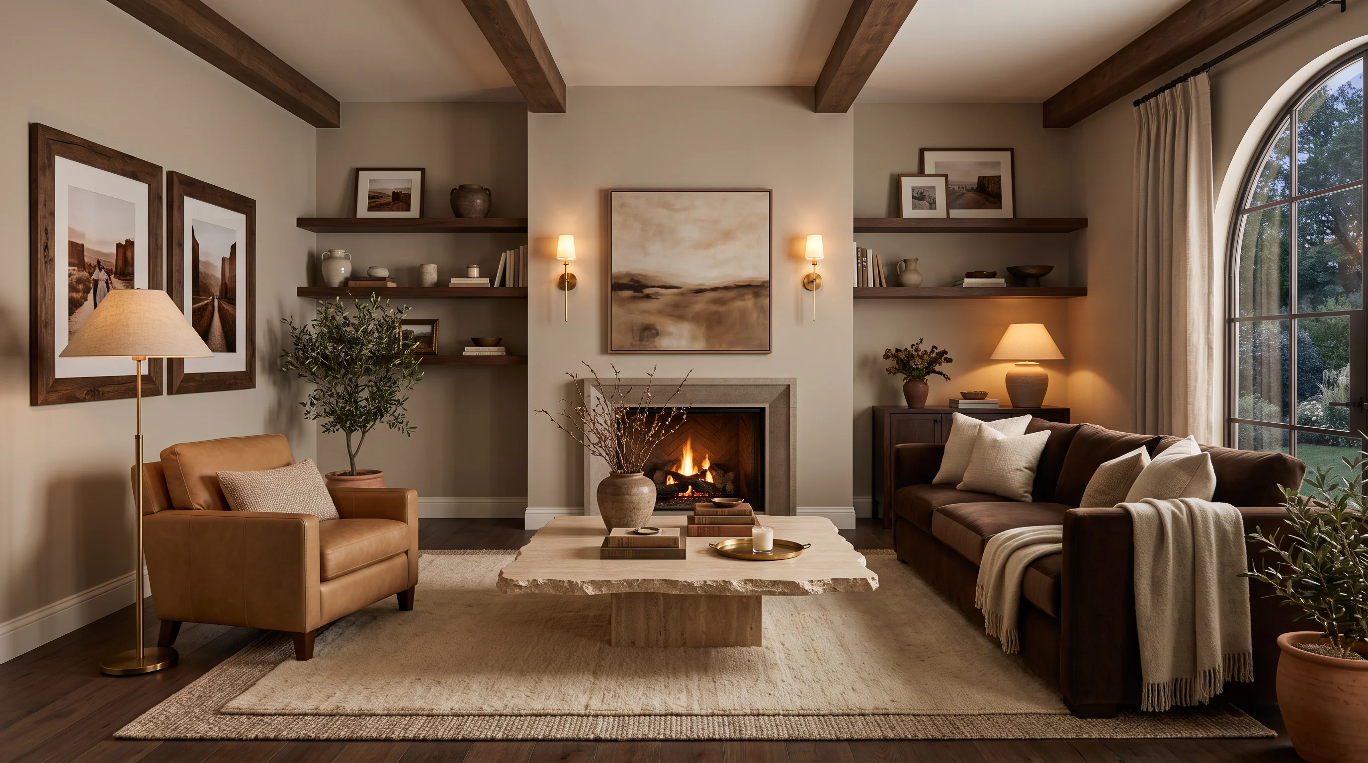
Lighting: the invisible make-or-break
Every palette above will fail under wrong lighting. The rules:
- Bulb temperature: 2700K for living rooms (the standard "warm white"). Never higher than 3000K. Smart bulbs that shift from 2700K (evening) to 3000K (daytime) are ideal.
- Layer three sources minimum: One overhead (dimmed low), one floor lamp (ambient), one table lamp (task/mood). Ideally add wall sconces as a fourth layer.
- Avoid: Overhead-only lighting (creates flat, hospital feeling), exposed cool-white bulbs, chrome fixtures in warm schemes.
- The test: If your warm walls look gray or flat at night, your bulbs are too cool. Swap to 2700K and the palette will instantly come alive.
Materials quick-reference
| Material | Warm neutral role | Avoid |
|---|---|---|
| Walnut | Grounding, depth | Cherry (too red), ash (too cool) |
| Oak (warm) | Mid-tone structure | Pickled/whitewashed oak (too cool) |
| Linen | Softening, light-catching | Polyester (reads cold) |
| Bouclé | Texture, luxury | Flat microfiber (no depth) |
| Leather (cognac/caramel) | Warmth, patina over time | Black leather (too cool) |
| Travertine | Earthy anchor | Polished white marble (too cold) |
| Brass (brushed) | Warm connective metal | Chrome, polished nickel |
| Jute/sisal | Natural ground layer | Cool-gray synthetic rugs |
Preview warm neutrals in your space
The hardest part of choosing a warm neutral palette is imagining how it will look in your room — with your specific light, flooring, and architecture. A color that looks perfect on a mood board can read entirely different in a north-facing room with cool LED downlights.
EasyRoomAI solves this: upload a photo of your current living room and see it transformed into any of these palettes — with your actual layout, windows, and proportions preserved. Test five directions in five minutes before spending a dollar on paint samples.
- Preview your living room transformation →
- See all 22 living room trends for 2026 →
- Explore warm minimalism →
FAQ
What are the best warm neutral paint colors for 2026? Benjamin Moore White Dove (warm white base), Sherwin-Williams Accessible Beige (versatile mid-neutral), Benjamin Moore Pashmina (mushroom, 2026 Color of the Year), Farrow & Ball Elephant's Breath (complex taupe), and Farrow & Ball Dead Salmon (dusty terracotta-pink) are the most-specified by designers this year.
Is beige coming back in style? It never truly left — it evolved. The 2026 version of beige is more complex: mushroom tones, warm taupes, and greiges that shift with light. It is not the flat builder-beige of the 1990s. When layered with texture and warm metals, modern beige reads sophisticated and intentional.
How do I make a neutral living room not look boring? Texture is the answer. Layer at least three different textures (bouclé, linen, wood, stone, leather) and vary the depth of your neutrals (light walls, medium sofa, dark accents). Add one organic material (travertine table, walnut shelving) and warm brass as a connective metal. The variety within a single temperature creates richness without color.
What undertone should I look for in a warm neutral? Yellow-brown undertones for the warmest reads. Avoid gray undertones (they'll pull cool) and pink undertones unless you specifically want a blush direction. Test with at least an A4-sized swatch on your actual wall, observed at multiple times of day.
Can I mix warm neutrals with cool accents? Sparingly. One cool-toned element (a blue-green plant, a matte-black frame) can work as punctuation. But if more than 10% of the room reads cool, the temperature will feel conflicted. Commit to warm as the dominant language.
Ready to Transform Your Space?
Try AI room redesign for free - no credit card required.
Start Designing FreeRelated reading
Living Room Ideas 2026: 22 Trends That Prove 'Instagram Interiors' Are Over
The staged, scroll-friendly living room is dead. In 2026, designers are building spaces that feel personal, warm, and intentionally imperfect. Here are 22 living room ideas — from earthy palettes to curved furniture to conversation layouts — shaping the year.
Maximalist Interior Design: The 2026 Guide to Bold, Curated, Personal Spaces
Minimalism had its decade. Pinterest reports eclectic apartment searches up 630% and vintage maximalism up 260%. Here is how to do maximalist interiors with intention — bold color, layered pattern, personal story, zero chaos.
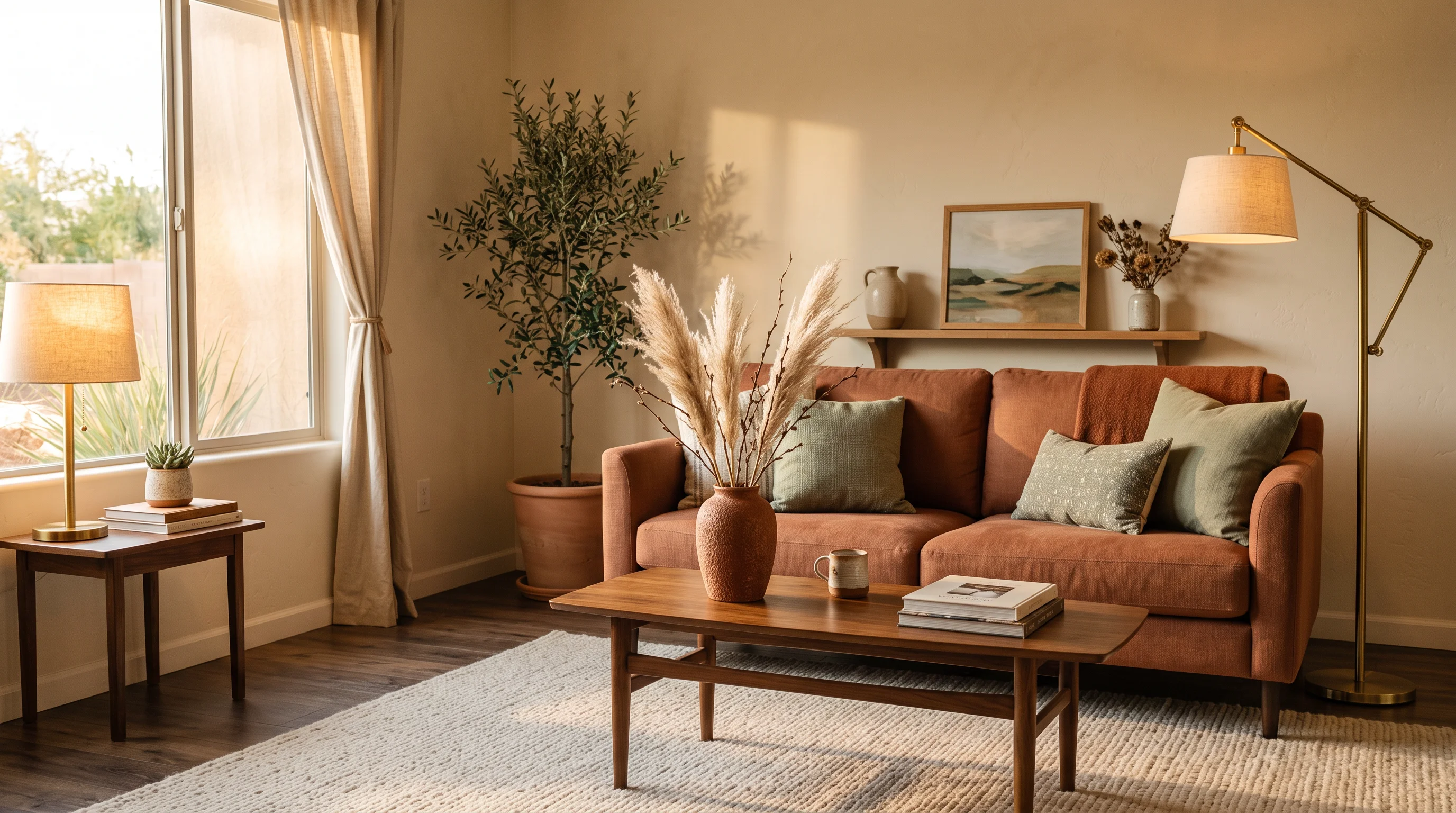
Earth Tone Living Room Ideas: 15 Warm Palettes Designers Are Using in 2026
Searches for earthy living rooms jumped 220% since 2023. Terracotta, sage, rust, and warm neutrals are replacing cool grays everywhere. Here are 15 earth-tone palettes that actually work — with styling rules to keep them warm without heavy.