Dopamine Decor: 26 Color-Drenched, Joyful Room Ideas (2026)
Dopamine decor designs for how a room makes you feel — bold color, playful pattern, and personal objects instead of beige restraint. Here's the 2026 guide: what it actually means, building a joyful palette, color blocking and pattern mixing, renter-friendly moves, room-by-room examples, and how to keep it cohesive instead of chaotic.
After a decade of greige restraint, the pendulum is swinging hard toward joy. Dopamine decor — designing a room around how it makes you feel, with saturated color, playful pattern, and personal objects — has matured from a social-media moment into a real design philosophy. Domus describes it as a reaction to minimalism's "aesthetics of neutrality": hyper-neutral interiors were meant to soothe, but often ended up feeling distant and abstract. The numbers back the shift — in the 1stDibs designer survey we covered in our 2026 interior color trends guide, 39% of designers anticipated maximalism's return.
This guide breaks down dopamine decor for 2026: what it actually is (and isn't), how to build a palette that energizes without exhausting, and 26 ideas to bring joy into your rooms — without tipping into chaos.
In this guide you will learn:
- What dopamine decor actually means (vs minimalism)
- How to build a joyful palette that doesn't overwhelm
- Color blocking and pattern mixing that works
- Renter-friendly and budget dopamine moves
- Room-by-room examples
- How to keep it cohesive, not chaotic
1. What dopamine decor is (and what it isn't)
Dopamine decor is decorating for emotional response: choosing colors, textures, and objects because they genuinely lift your mood, not because they follow a tasteful formula. The name borrows from the brain's feel-good neurotransmitter, and while no paint color literally doses you, the color-psychology logic is real — bright, saturated hues and beloved personal objects reliably trigger positive associations.
Two clarifications keep the trend honest:
- It's the opposite of minimalism, not the absence of design. Where cold minimalism subtracts until a room is calm and quiet, dopamine decor adds until a room feels alive — but both are deliberate. Behind the joyful look, the discipline remains: Domus notes that classic rules like the 60-30-10 color distribution and pattern repetition are exactly what make these rooms work.
- It's personal by definition. A sunshine-yellow kitchen is dopamine decor only if yellow is your happy color. The trend's core question is "what do I love to look at?" — not "what's trending?"
The takeaway: dopamine decor means designing for feeling — bold color, playful pattern, and objects with personal meaning — executed with the same discipline minimalism uses, just pointed at joy instead of quiet.
2. Building a joyful palette
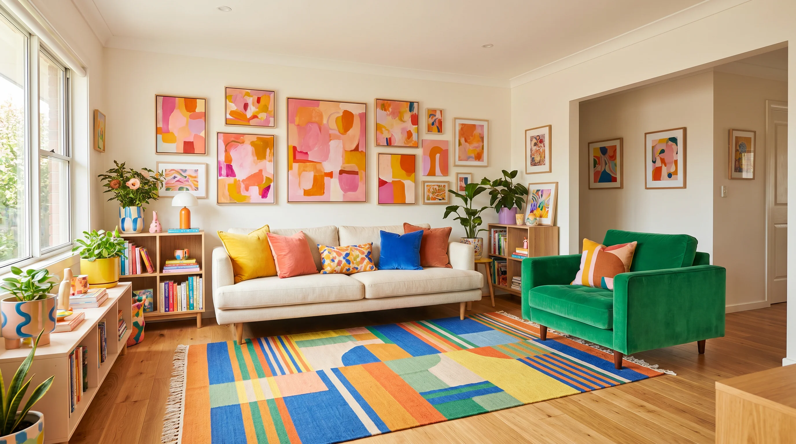
The fastest way to ruin a dopamine room is to use every color you love at full volume. The 2026 version of the trend — what some call "dopamine decor 2.0" — tempers the sugar rush with a grounded base: organic-modern foundations in soft neutrals and natural wood, with saturated accents doing the emotional work.
Build the palette in three moves:
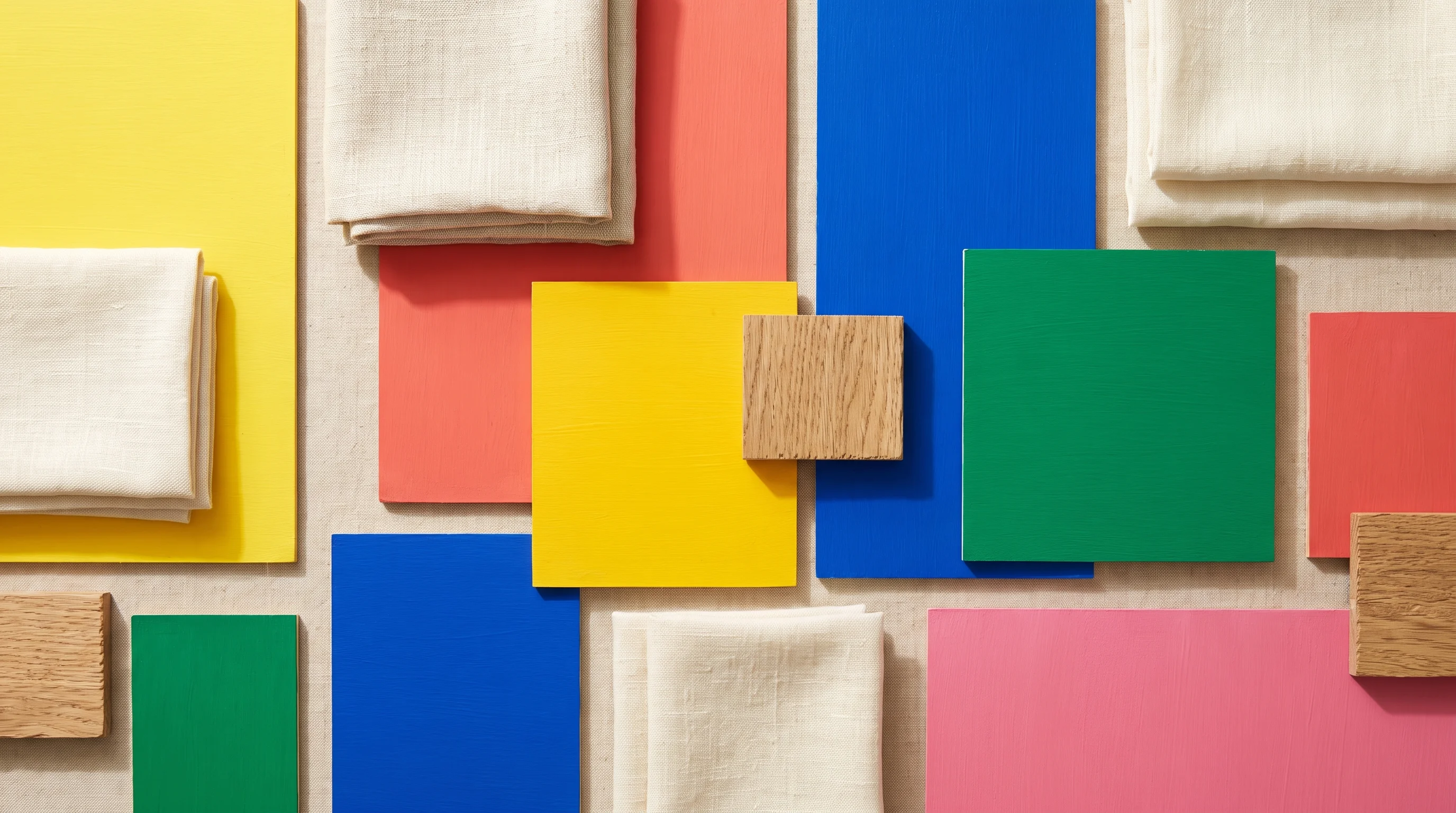
- Pick 2–3 hero hues you have a genuine emotional response to — sunshine yellow, coral, cobalt, emerald, warm pink. Color psychology gives loose guidance (yellow for optimism, blue for calm focus, orange for energy), but your own associations outrank the chart.
- Ground them with 60% calm. Warm white walls, oatmeal upholstery, or natural wood give the eye somewhere to rest — that's what separates "joyful" from "loud."
- Repeat each hero at least twice across the room (a chair, then a cushion, then art) so the color reads intentional rather than accidental.
The takeaway: two or three colors you truly love, grounded by a calm 60% base and repeated around the room — that's a dopamine palette that energizes on day one and still works in year three.
3. Color blocking and pattern mixing
Once the palette exists, the fun is in how boldly you apply it:
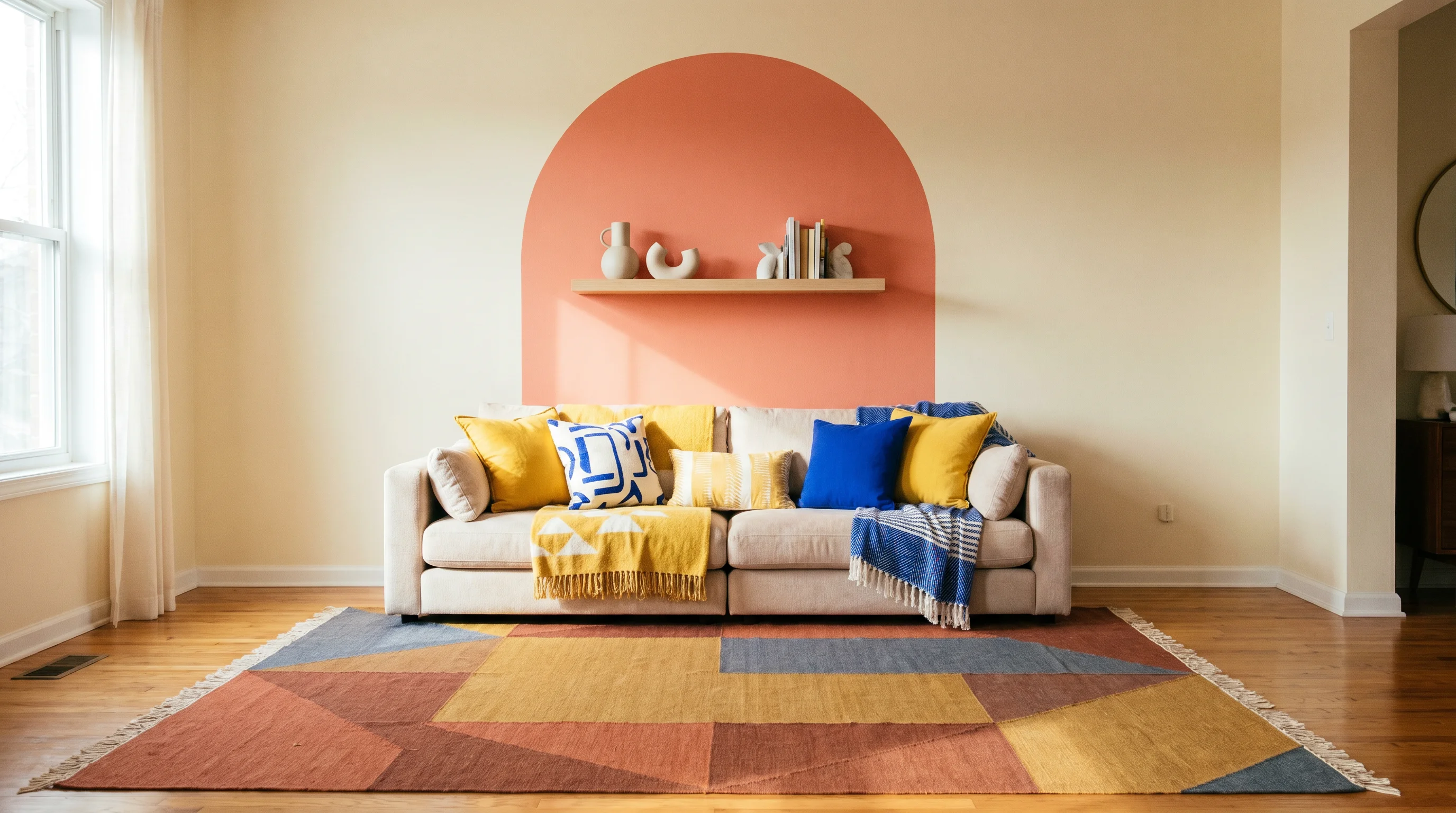
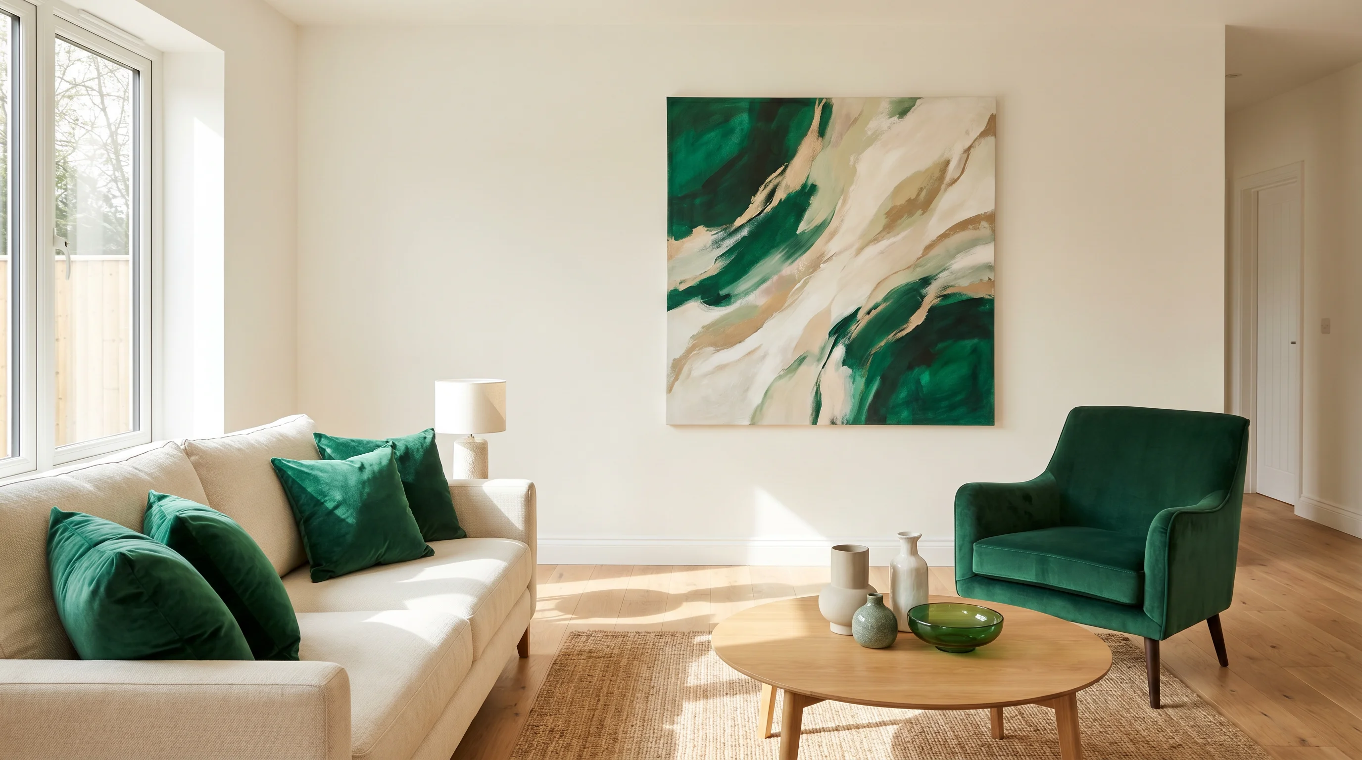
- Color blocking: paint a crisp geometric zone — a half-wall, an arch behind a shelf, a painted headboard shape — instead of a whole room. It delivers the saturated hit with built-in restraint.
- Drenching a single room: for full commitment, take one room and saturate it — walls, trim, even ceiling — in a happy hue. (Our color drenching guide covers the technique step by step.)
- Pattern mixing that works: vary the scale — one large-scale pattern (rug or wallpaper), one medium (curtains or sofa fabric), one small (cushions) — and let them share at least one color from your palette. That shared thread is what makes stripes, florals, and checks read as a family.
- Use the 80/20 room split: keep architecture and big-ticket pieces 80% grounded, and let the swappable 20% — cushions, art, lamps, throws — carry the boldest joy.
The takeaway: block color into deliberate shapes, mix patterns by varying scale while sharing a palette color, and let the swappable layer carry the wildest moves — bold reads as confident when the geometry underneath is disciplined.
4. Dopamine decor on a budget (and for renters)
Because dopamine decor lives in color and objects rather than construction, it's one of the most renter-friendly and budget-friendly trends going:
- Textiles first: a saturated rug, colorful bedding, and a pile of mixed cushions transform a room for the price of one furniture piece — and move out when you do.
- A gallery wall of things you love: prints, kids' art, flea-market finds, concert posters. Personal beats expensive in this trend, every time.
- Paint one thing: a thrifted dresser in glossy coral, a bookshelf interior in emerald, a door in sunshine yellow. Small painted moments deliver outsized joy per dollar.
- Peel-and-stick wallpaper on one wall or in a rental kitchen brings pattern without a deposit conversation.
- Colored lighting moments: a colorful lamp base or a warm-glow bulb in a corner reads playful after dark.
The takeaway: rugs, cushions, art, and one brave coat of paint deliver the full dopamine effect without touching walls or budgets — this trend rewards personality, not spend.
5. Room-by-room dopamine moves
Different rooms tolerate different doses. Where designers are applying the trend in 2026:
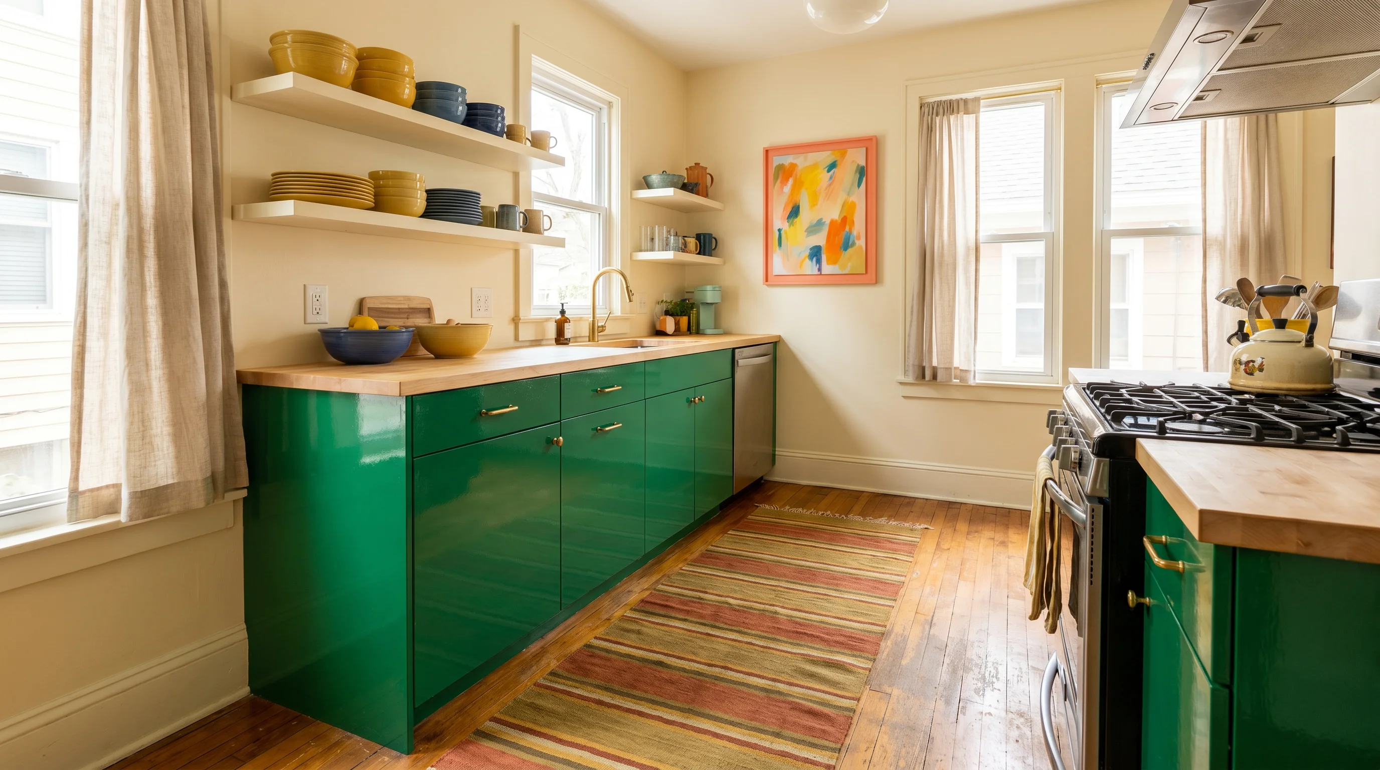
- Kitchen: a colorful island or lower cabinets (emerald, cobalt, even glossy coral) against calm walls; colorful ceramics on open shelves do the rest.
- Living room: one saturated statement sofa or one drenched wall — not both — plus playful art and layered pattern in the cushions.
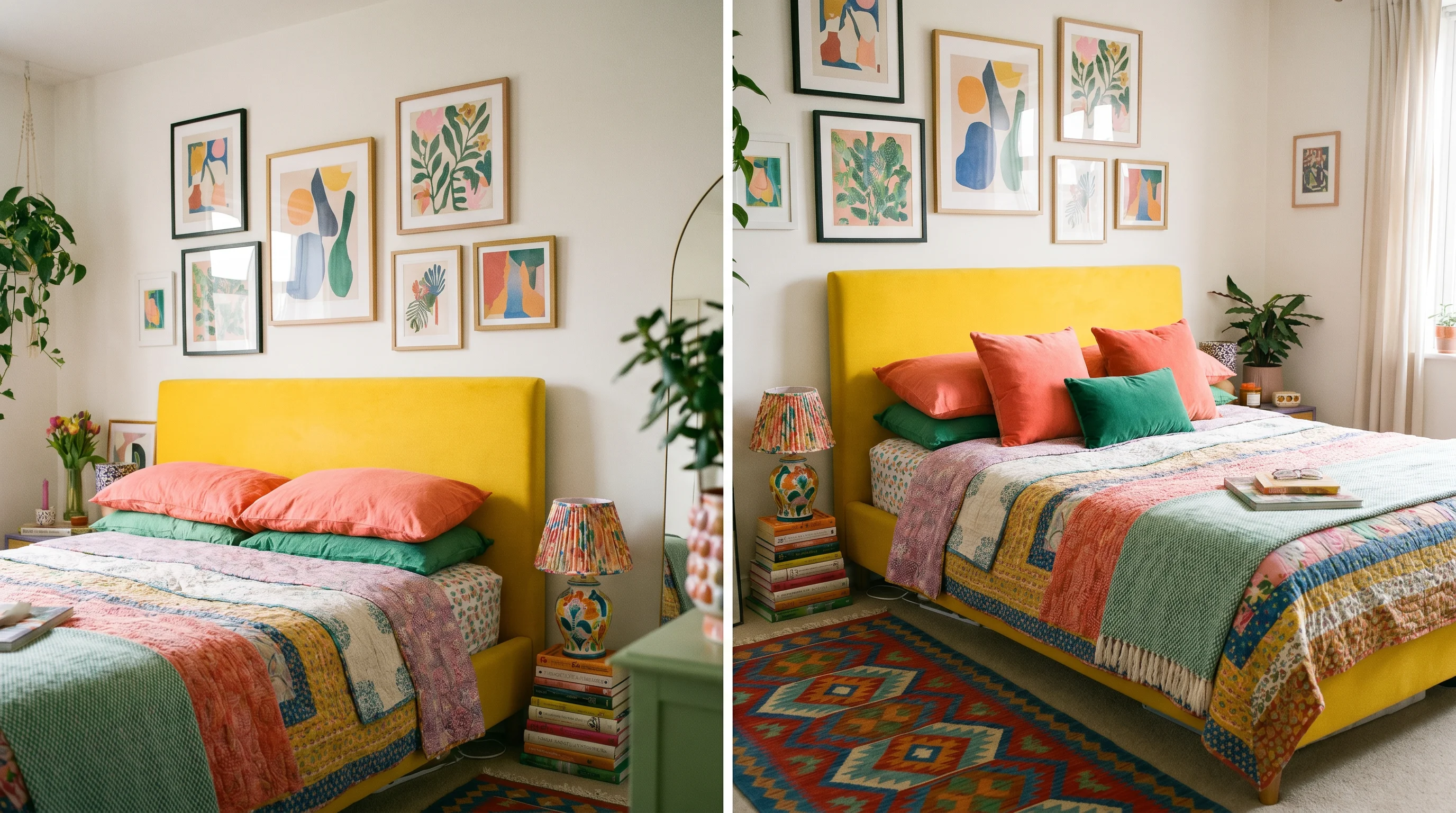
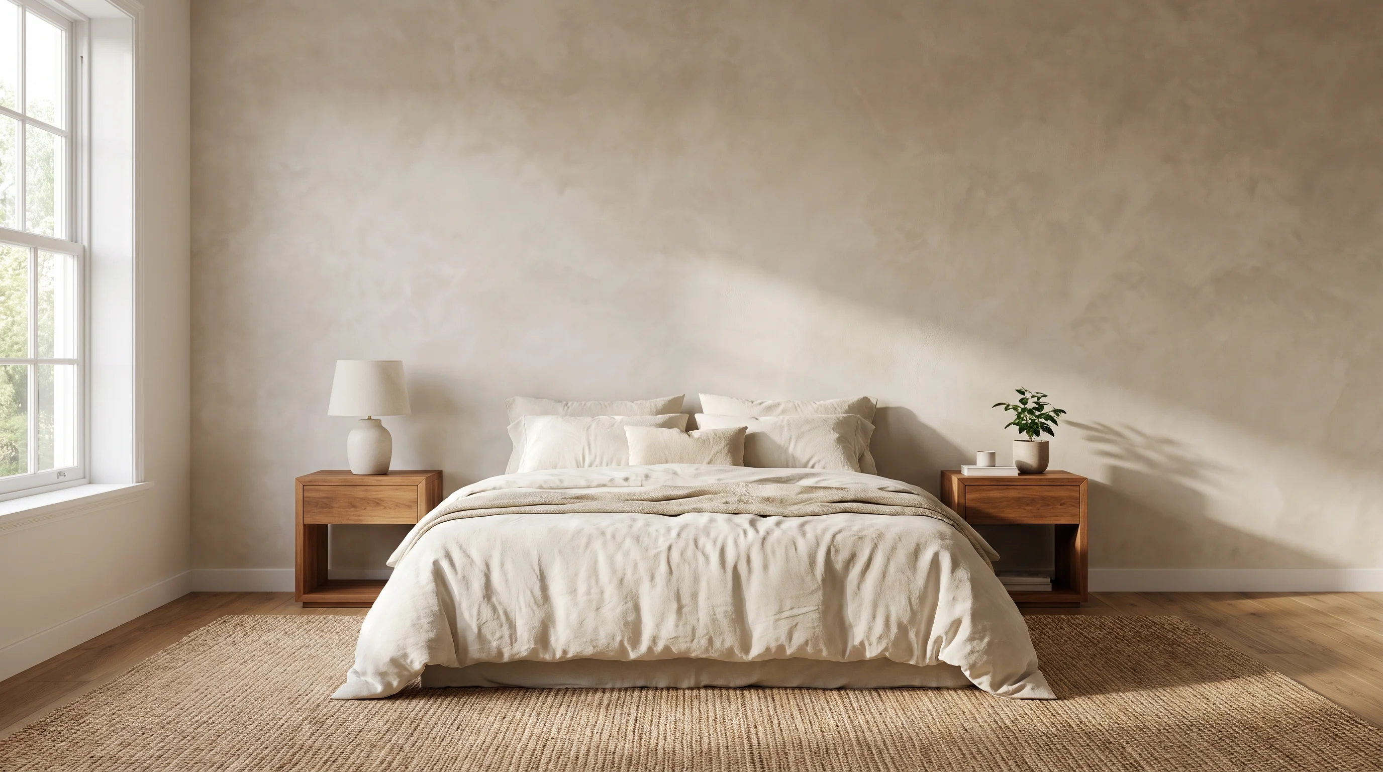
- Bedroom: joyful but sleep-safe — a bold upholstered headboard, colorful quilt, and art above the bed, with walls in a softer tint so mornings feel bright and nights stay restful.
- Kids' rooms and playrooms: the natural habitat — see our playroom ideas for zoning bold color so it stimulates play without overstimulating bedtime.
- Home office: an energizing accent wall (yellow-green, coral) behind the desk lifts video calls and Monday mornings alike.
- Entry or powder room: the lowest-risk, highest-delight spot — drench it completely and let guests walk into a mood.
The takeaway: match the dose to the room — full drama in small transient spaces like entries and powder rooms, one hero move in living spaces, and softer tints where you sleep.
6. Keeping it cohesive, not chaotic
The line between joyful and jumbled is thinner than Pinterest suggests. What keeps a dopamine room on the right side:
- Repeat, repeat, repeat. Every color appears at least twice; every pattern shares a palette color. Repetition is the difference between "collected" and "random."
- Keep one neutral constant — the same warm white on trim, the same wood tone across furniture — as the visual thread through every bold choice.
- Edit ruthlessly. Dopamine decor celebrates objects with meaning, not all objects. If a piece doesn't genuinely spark something, it's clutter wearing a trend's name.
- Leave breathing room. Saturated color needs empty space around it to register — a bold wall reads bolder next to a bare one.
- Test before you commit. Saturated colors shift dramatically with light, and a joyful swatch can turn neon at wall scale.
The takeaway: cohesion comes from repetition, one constant neutral, and ruthless editing — a dopamine room should feel like a curated celebration of what you love, not everything you own at once.
See your room in full color before you paint
The biggest barrier to dopamine decor is fear of commitment — will that coral wall feel joyful or exhausting? Upload a photo of your room to EasyRoomAI and test the bold version before you buy paint: try a drenched emerald living room, a color-blocked bedroom wall, or a yellow kitchen island, and see the whole palette in your actual light.
- Try a free room redesign — anonymous previews are free, no signup needed.
- Exploring the opposite direction? Read our cold minimalism guide for the calm end of the spectrum, our color drenching guide for the technique, or the full 2026 interior color trends overview.
Frequently asked questions
What is dopamine decor? Dopamine decor is an interior design approach that prioritizes emotional response over neutral restraint — using saturated color, playful pattern, tactile texture, and personal objects to create rooms that actively lift your mood. The name references the brain's feel-good neurotransmitter. It emerged as a reaction to a decade of minimalist, greige interiors, and by 2026 has matured into a more grounded version that balances bold accents with calm foundations.
Is dopamine decor the same as maximalism? They overlap but aren't identical. Maximalism is an aesthetic — more color, more pattern, more objects. Dopamine decor is a purpose — designing for joy — and it can be executed at any intensity. A mostly-neutral room with one sunshine-yellow chair you love is dopamine decor; a magazine-styled maximalist room full of objects that mean nothing to you isn't.
How do I do dopamine decor without it looking messy? Use discipline under the joy: ground the room with a 60% calm base (warm white, wood, oatmeal), limit yourself to 2–3 hero colors and repeat each at least twice, vary pattern scales while sharing a palette color, and edit out anything that doesn't genuinely spark a response. Repetition and one constant neutral are what make bold rooms read as intentional.
What colors are used in dopamine decor? Whatever colors genuinely make you happy — that's the point. That said, the common 2026 palette leans warm and saturated: sunshine yellow, coral, cobalt blue, emerald green, and warm pink, usually set against organic-modern neutrals like cream and natural wood. Color psychology offers loose guidance — yellow for optimism, blue for calm, orange for energy — but personal association matters more than any chart.
Is dopamine decor renter-friendly? Very. Because the trend lives mostly in textiles, art, and objects rather than construction, renters can go all-in with colorful rugs, bedding, cushions, gallery walls, painted thrift furniture, and peel-and-stick wallpaper — all of it reversible and movable. One brave paint color on a single wall (with landlord blessing) is the only semi-permanent move most dopamine rooms need.
Dopamine decor is minimalism's joyful correction: same discipline, opposite goal. Pick the colors that genuinely lift you, ground them in calm, repeat them with intent, and fill the room only with things you love looking at. Then preview the bold version in your own space — before commitment anxiety talks you back into beige.
Ready to Transform Your Space?
Try AI room redesign for free - no credit card required.
Start Designing FreeRelated reading
Muted Kitchen Colors: 24 'Dirty' Tone Ideas for 2026
Crisp white kitchens are giving way to softer, 'dirty' tones with warmth and depth. Here's a guide to muted kitchen colors for 2026 — what makes a color 'muted,' the full palette family from mushroom to muddy green, where to use them, how to pair them with wood and stone, and before-and-after inspiration.
Black & Gold Bathroom: 25 Luxe Ideas for 2026
Black and gold is the shortcut to a bathroom that reads like a boutique hotel. Here are 25 black and gold bathroom ideas for 2026 — why the pairing looks luxe, the 70/30 balance rule, small-bathroom tactics, tile and finish combos, lighting and mirrors, and full-drama powder rooms.
Limewash Walls: 22 Beige & Brown Limewash Ideas (2026)
Limewash gives walls a soft, cloudy, mineral texture you can't fake with regular paint. Here are 22 limewash wall ideas for 2026 — beige vs brown vs greige, DIY application basics, the best rooms for it, furniture pairings, and what it really costs.