Muted Kitchen Colors: 24 'Dirty' Tone Ideas for 2026
Crisp white kitchens are giving way to softer, 'dirty' tones with warmth and depth. Here's a guide to muted kitchen colors for 2026 — what makes a color 'muted,' the full palette family from mushroom to muddy green, where to use them, how to pair them with wood and stone, and before-and-after inspiration.
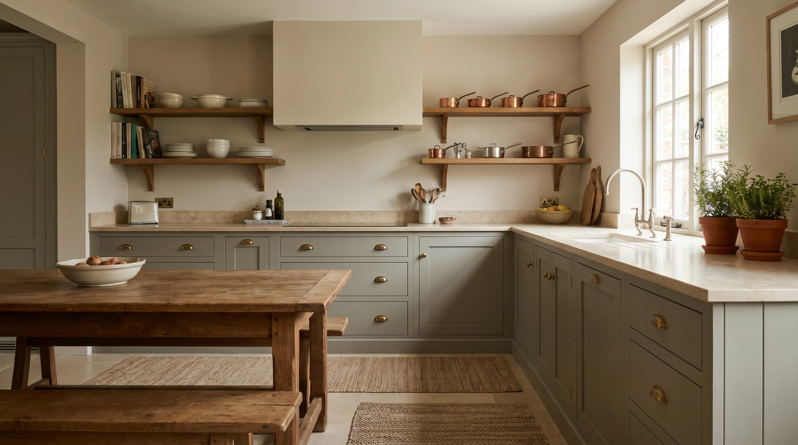
The crisp, all-white kitchen is quietly stepping aside for something softer, warmer, and far more forgiving: muted, "dirty" tones. House Beautiful reports that designers are ditching crisp white paints for these "dirty neutrals" — complex, greyed-down shades like mushroom, greige, and olive — and Benjamin Moore even named one, Pashmina, its 2026 Color of the Year. Their appeal is complexity: part gray, part brown, with undertones that shift with the light.
This guide is a family-level overview of muted kitchen colors for 2026 — what unites them, the shades leading the trend, and how to use them. For deep dives on specific directions, we'll point you to our sage green kitchen and kitchen cabinet color trends guides along the way.
In this guide you will learn:
- What makes a kitchen color "muted" or "dirty"
- The 2026 muted palette family, shade by shade
- Where to use muted tones — cabinets, walls, and islands
- How to pair them with countertops, wood, and metals
- How to light muted tones so they don't fall flat
- Before-and-after inspiration
1. What "muted" or "dirty" kitchen colors are
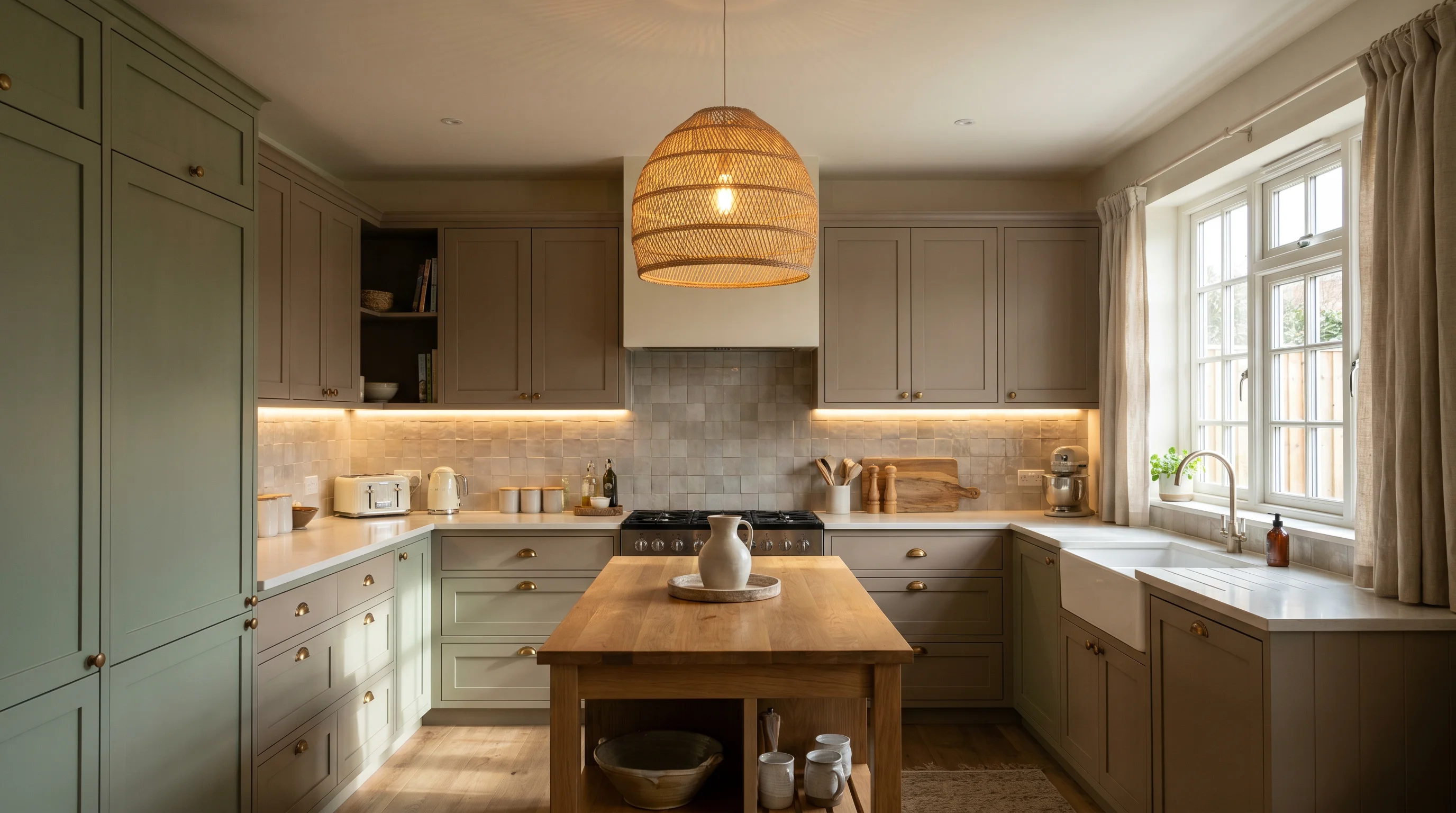
A muted or "dirty" color is one that's been greyed down or softened, rather than pure and saturated. Instead of a clean, bright green, you get a greyed-out olive; instead of stark white, a complex mushroom or greige. As House Beautiful puts it, these hues live "in that hazy middle ground between beige, taupe, and gray," with undertones that shift as the light changes.
Two things make them perfect for kitchens specifically:
- They're forgiving. Muddied, earthy tones hide everyday wear, fingerprints, and imperfections far better than crisp white or high-gloss color — ideal for a hardworking family space.
- They feel grounded, not sterile. They read warm, timeless, and lived-in rather than clinical, which is exactly the direction kitchens are heading.
The takeaway: a muted color is a softened, greyed-down version of a hue — and in a kitchen that translates to warmth, depth, and a finish that hides real life instead of showing every smudge.
2. The 2026 muted palette family
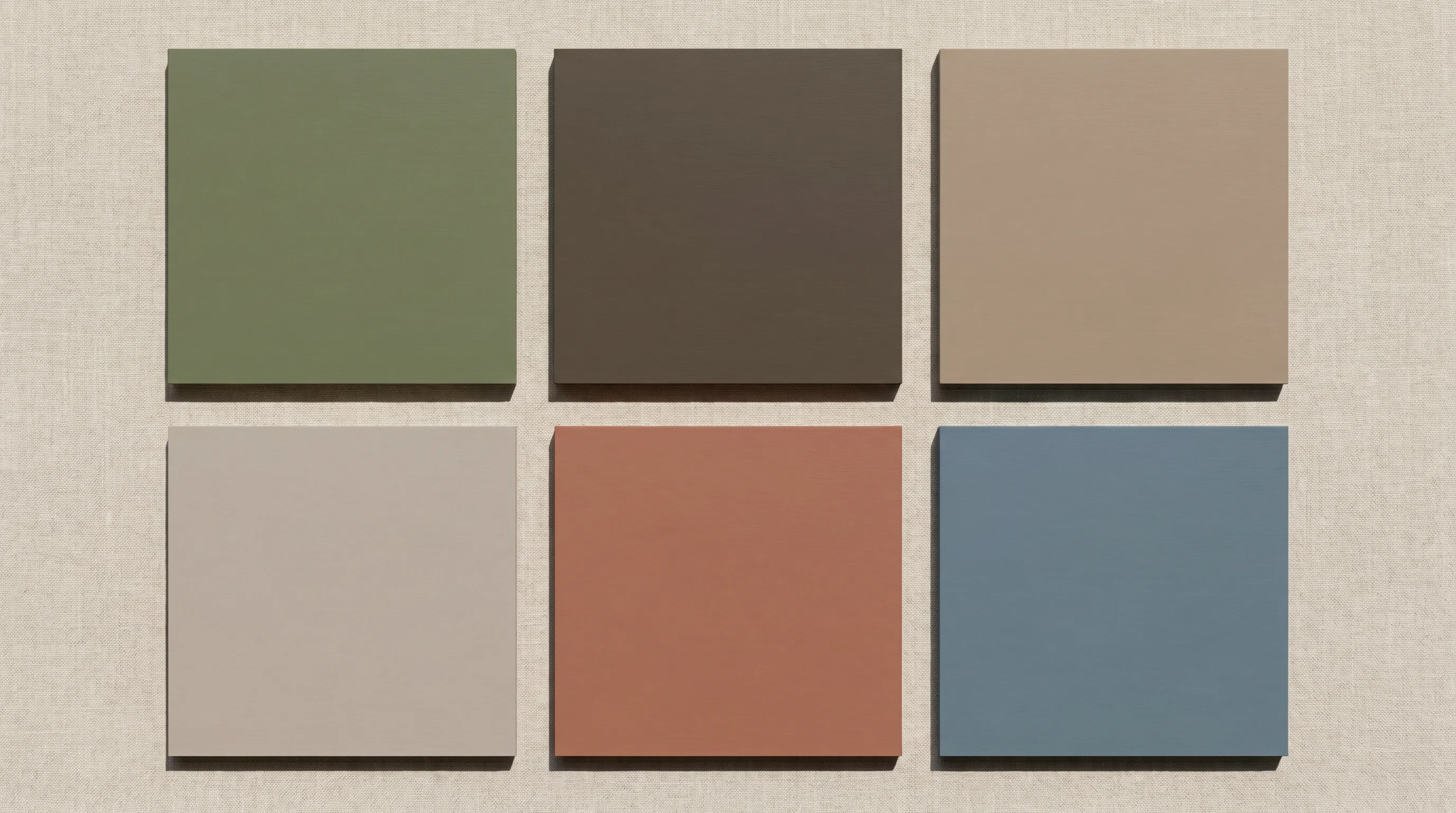
The "dirty" palette isn't one color — it's a whole family of related, earth-adjacent tones. The ones leading kitchens in 2026:
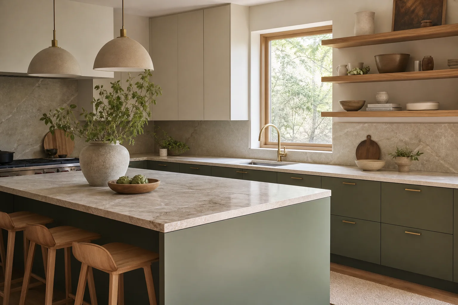
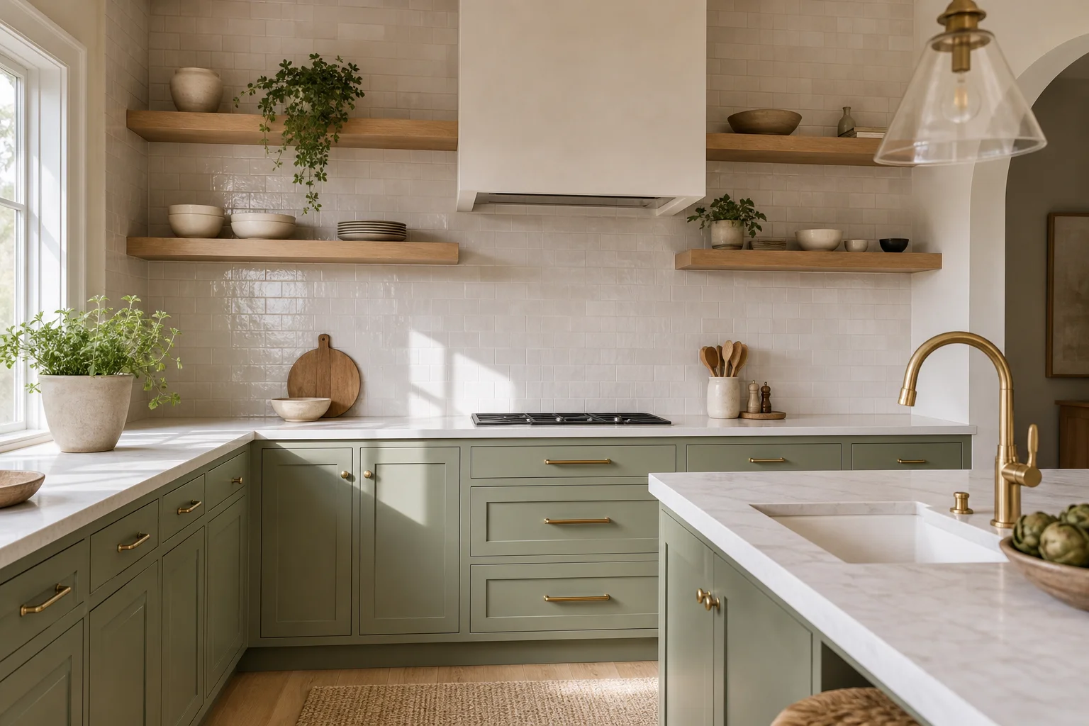
- Greyed greens — muddy olive, sage, and moss. The most popular direction; for a full breakdown see our sage green kitchen ideas.
- Muddy browns and clay — cognac, terracotta-adjacent, and chocolate-leaning earth tones.
- Mushroom, greige, and putty — the warm, complex neutrals doing the heavy lifting (Benjamin Moore's Pashmina lives here).
- Dusty and smoky blues — a cooler but still softened option, great on an island.
The National Kitchen and Bath Association's 2026 report backs the shift: warm, earthy neutrals lead kitchens (favored by nearly all designers surveyed), with greens close behind and blues in a supporting role.
The takeaway: think of muted kitchen color as a family — greyed greens, muddy browns, warm mushrooms and greiges, and dusty blues — all softened and earthy, so they mix and layer instead of competing.
3. Where to use muted tones
Because muted tones are gentle, you can use them far more liberally than a saturated color — often in more than one place at once:
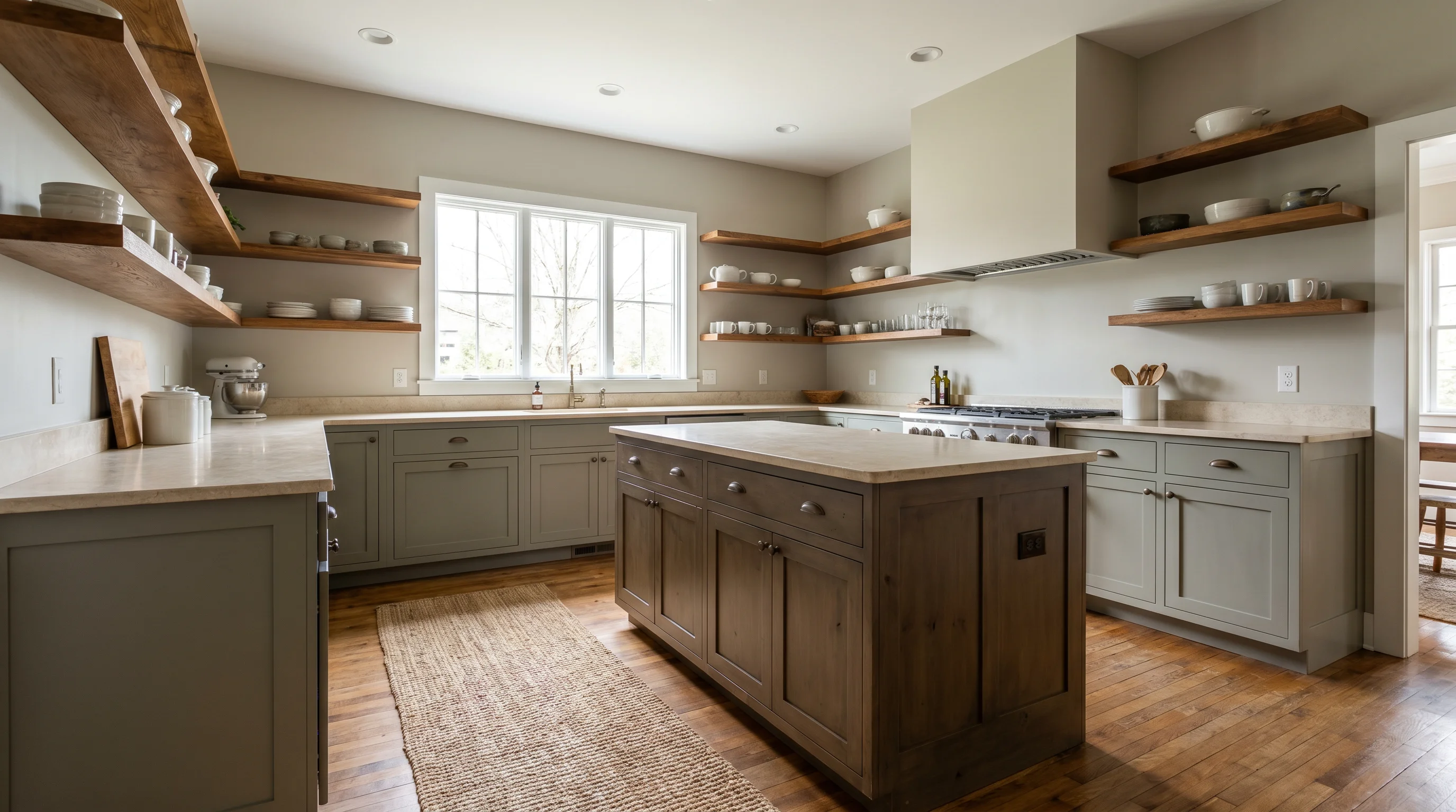
- Cabinets are the biggest move. A muddy green or greige on the lowers (or all around) sets the whole tone. For the cabinet-specific angle — finishes, two-tone combinations, and wood grains — see our kitchen cabinet color trends guide.
- Walls in a soft greige or mushroom keep the room warm without shouting.
- The island is the place to layer a second muted shade — a dusty blue or muddy brown island against greige perimeter cabinets reads intentional, not clashy.
Designers increasingly build "milder" two-tone schemes using two muted shades rather than high-contrast color, layering and repeating tones across cabinets, walls, and island.
The takeaway: muted tones are forgiving enough to use in layers — set the mood with cabinets, warm the walls with a soft neutral, and use the island for a second muted shade to add depth.
4. Pairing with countertops, wood, and metals
Muted colors are team players — their whole job is to be a sophisticated backdrop that lets natural materials shine:
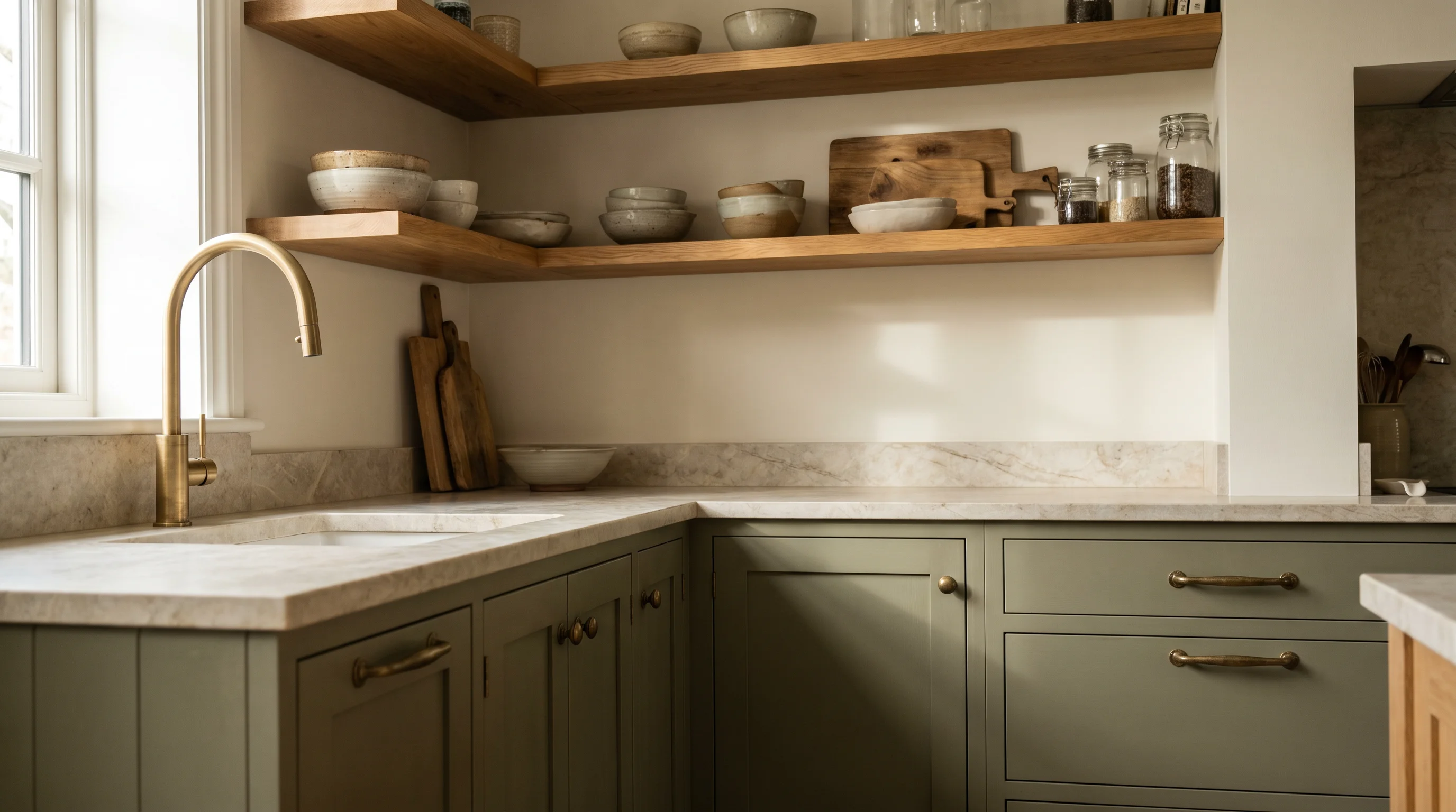
- Wood: warm woods are the natural partner. A greyed olive works precisely because it finds a middle ground with the orange undertones in oak instead of clashing the way a pure, saturated green would.
- Countertops: creamy quartz or warm quartzite in soft whites and browns, or honed stone with subtle veining, keeps the earthy, layered feel.
- Metals: brushed brass, aged bronze, and warm metals amplify the warmth; save cool chrome for cooler schemes.
Keep undertones in the same warm, earthy family so the whole room feels collected rather than assembled.
The takeaway: let muted cabinets be the backdrop and pair them with warm wood, creamy or honed stone, and brushed brass — the color's job is to make natural materials look richer, not to be the loudest thing in the room.
5. Lighting muted tones so they don't fall flat
Muted colors are the most light-sensitive of any palette — their complex, shifting undertones can look beautifully warm in one light and dull or grey in another. Get the light right:
- Test big samples on multiple walls and look at them morning, midday, and night before committing — a "dirty" tone can swing greener, browner, or greyer with the light.
- Layer warm light: warm-temperature bulbs keep earthy tones warm; cool light drains them grey.
- Add under-cabinet lighting to lift the work zone and stop deeper muted cabinets from feeling heavy.
- Lean on natural light where you can, and choose your shade for the light the room actually gets — north-facing kitchens push cooler, so warm the color up.
The takeaway: muted tones shift with the light, so test large samples across the day and layer warm lighting — the same "dirty" green can look sophisticated or muddy depending entirely on how it's lit.
6. Before and after
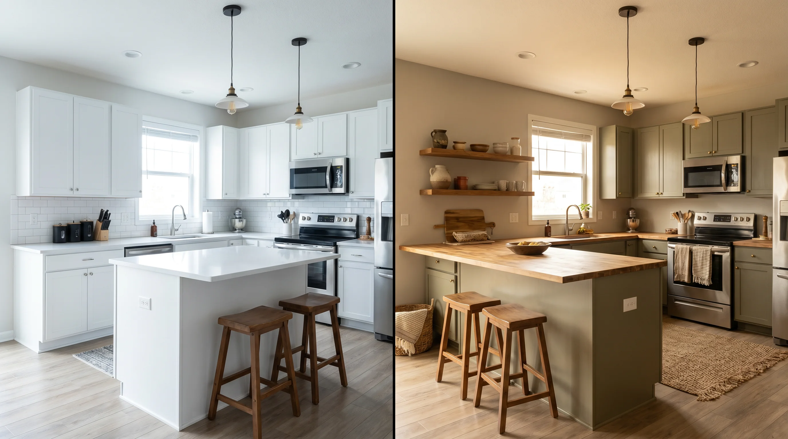
The clearest way to see the trend is side by side: a stark white kitchen reads clean but a little cold and clinical, while the same layout in warm muted tones — a greige wall, muddy-green cabinets, wood shelving — instantly feels grounded, cozier, and more expensive. Nothing about the layout changes; the shift is entirely in the color and materials.
The takeaway: swapping crisp white for a muted palette transforms the feeling of a kitchen without touching the layout — the same room goes from clinical to warm and collected purely through color.
See muted colors in your own kitchen
Muted tones are notoriously hard to judge from a paint chip — they shift with your light and your existing wood and stone. Upload a photo of your kitchen to EasyRoomAI and test the whole family: greyed green versus mushroom versus dusty blue, on the cabinets, the walls, or the island — all before you buy a single sample pot.
- Try a free room redesign — anonymous previews are free, no signup needed.
- Go deeper with our sage green kitchen ideas and kitchen cabinet color trends, or step back to the full 2026 interior color trends. Browse more kitchen layouts too.
Frequently asked questions
What are "dirty" or muted kitchen colors? They're softened, greyed-down versions of colors rather than pure, saturated hues — think greyed olive instead of bright green, or complex mushroom and greige instead of stark white. Designers call them "dirty neutrals," and they read warm, earthy, and lived-in. In a kitchen they're popular because they hide everyday wear and feel grounded rather than clinical.
What are the most popular muted kitchen colors for 2026? The leading family includes greyed greens (muddy olive, sage, moss), muddy browns and clay, warm mushrooms and greiges (Benjamin Moore's 2026 Color of the Year, Pashmina, lives here), and dusty or smoky blues. The NKBA's 2026 report shows warm earthy neutrals leading, with greens close behind and blues in a supporting role.
Do muted colors make a kitchen look dark or dingy? Not when they're lit and paired well. Muted tones are light-sensitive, so test large samples across the day and layer warm lighting — cool light can drain them grey. Pair them with warm wood, creamy stone, and brass, and use under-cabinet lighting to keep the space feeling warm and dimensional rather than flat.
How do I pair muted kitchen colors with wood and countertops? Keep everything in a warm, earthy undertone family. Greyed greens and browns work beautifully with warm oak and walnut because they meet the wood's orange undertones instead of clashing. Choose creamy quartz or honed stone with soft veining for countertops, and warm metals like brushed brass or aged bronze for hardware, so the color acts as a backdrop that makes natural materials shine.
Can I use more than one muted color in a kitchen? Yes — that's one of the biggest advantages. Because muted tones are gentle, you can layer them: a "milder" two-tone scheme might use greige perimeter cabinets with a muddy-green or dusty-blue island, plus a soft neutral on the walls. Layering and repeating related earthy tones reads intentional and collected, unlike high-contrast combinations.
Muted kitchen colors are really about trading clinical for cozy — softened, earthy tones that hide real life, flatter natural materials, and never feel dated. Pick your direction from the family, layer it across cabinets, walls, and island, light it warmly, and pair it with wood and stone. Then preview it in your own kitchen before you commit to a color.
Ready to Transform Your Space?
Try AI room redesign for free - no credit card required.
Start Designing FreeRelated reading
Kitchen Cabinet Color Trends 2026: The Colors Designers Ranked #1 (and What's Out)
634 industry pros ranked the kitchen colors that matter for 2026. Green leads at 86%, navy and warm neutrals are in, gray and bright white are fading — plus the two-tone and wood-grain looks taking over cabinetry.
Sage Green Kitchen Ideas: 8 Ways to Use 2026's Most-Wanted Color
Designers named green the #1 kitchen color for 2026 — and sage leads. Eight ways to use it on cabinets, islands and walls, plus the wood-and-brass pairings that make it look expensive.
Black & Gold Bathroom: 25 Luxe Ideas for 2026
Black and gold is the shortcut to a bathroom that reads like a boutique hotel. Here are 25 black and gold bathroom ideas for 2026 — why the pairing looks luxe, the 70/30 balance rule, small-bathroom tactics, tile and finish combos, lighting and mirrors, and full-drama powder rooms.